Please inquire for more information.

Microsoft
UX Designer II - Cloud Enterprise Software
Please inquire about specific details

Applique
Android UX/UI Designer
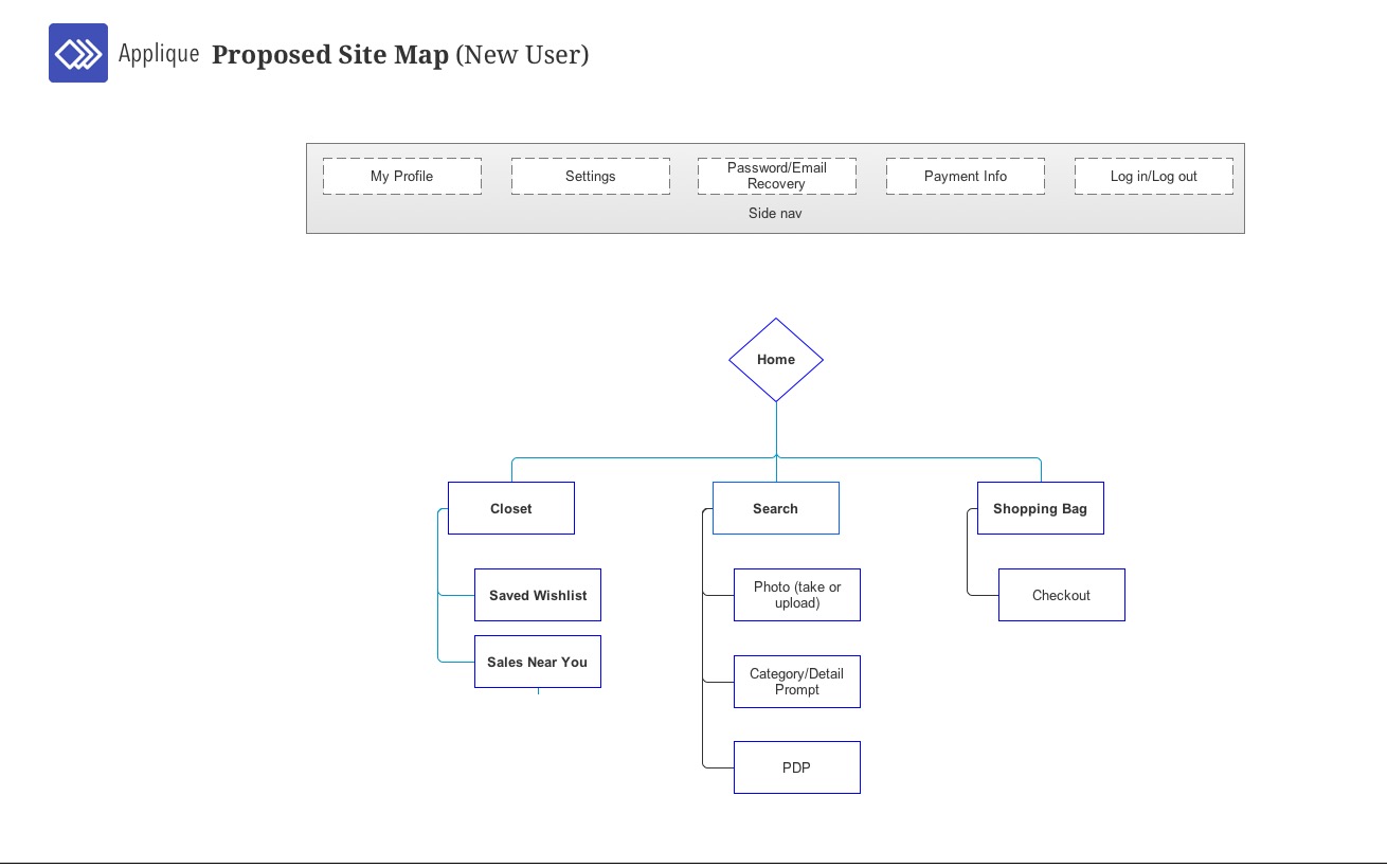
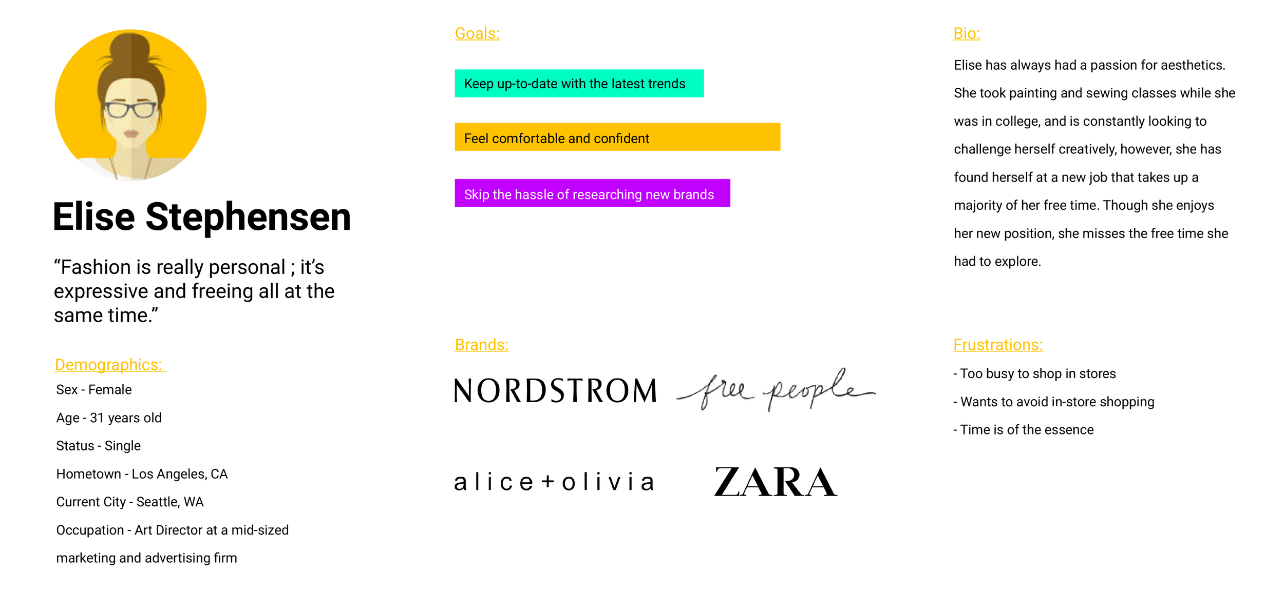
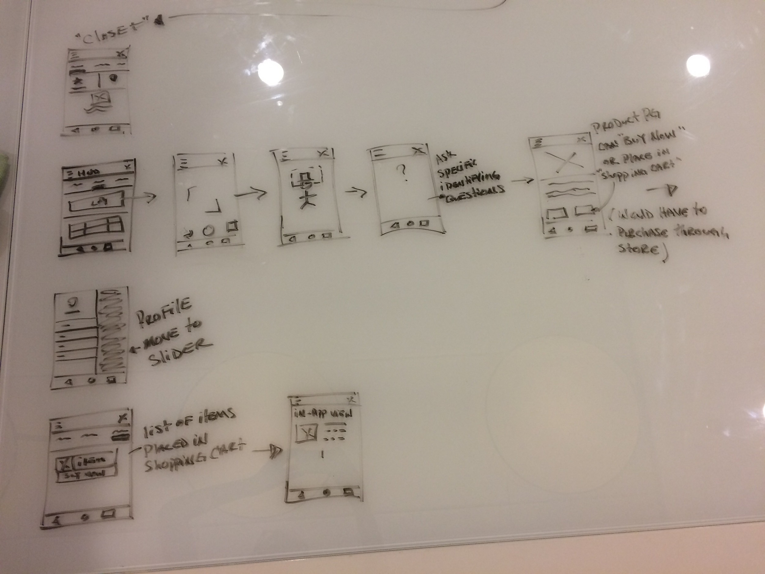
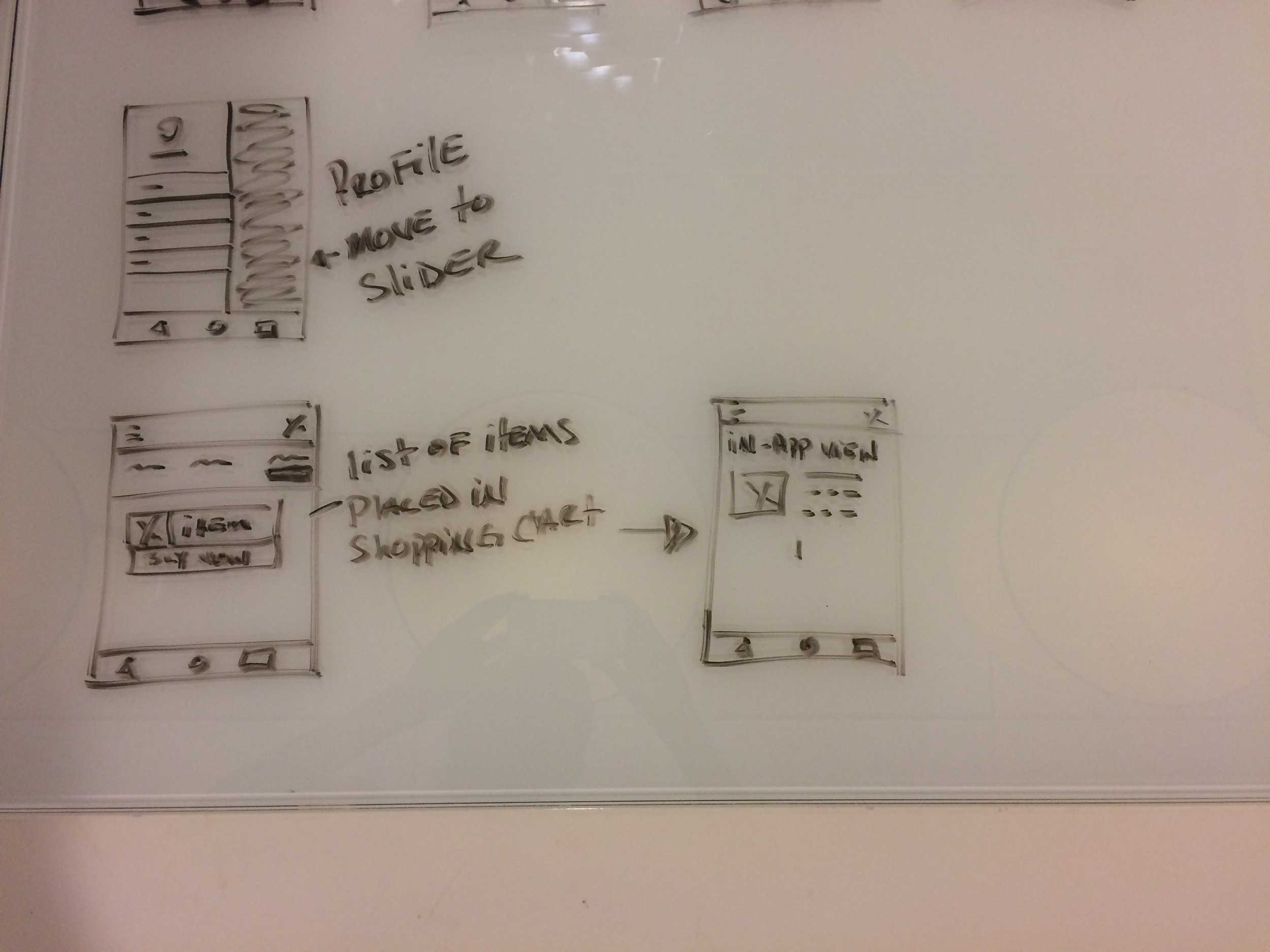
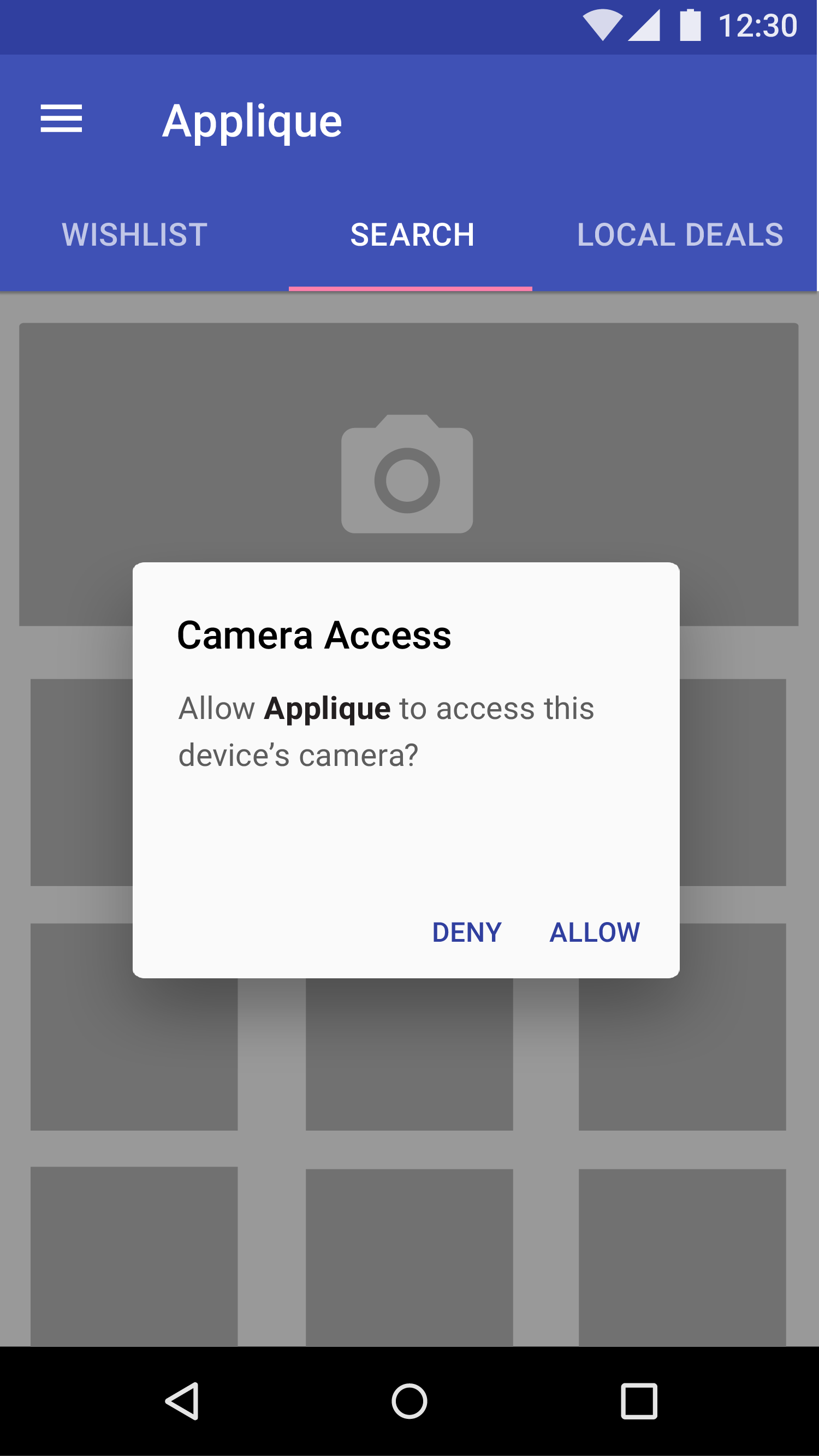
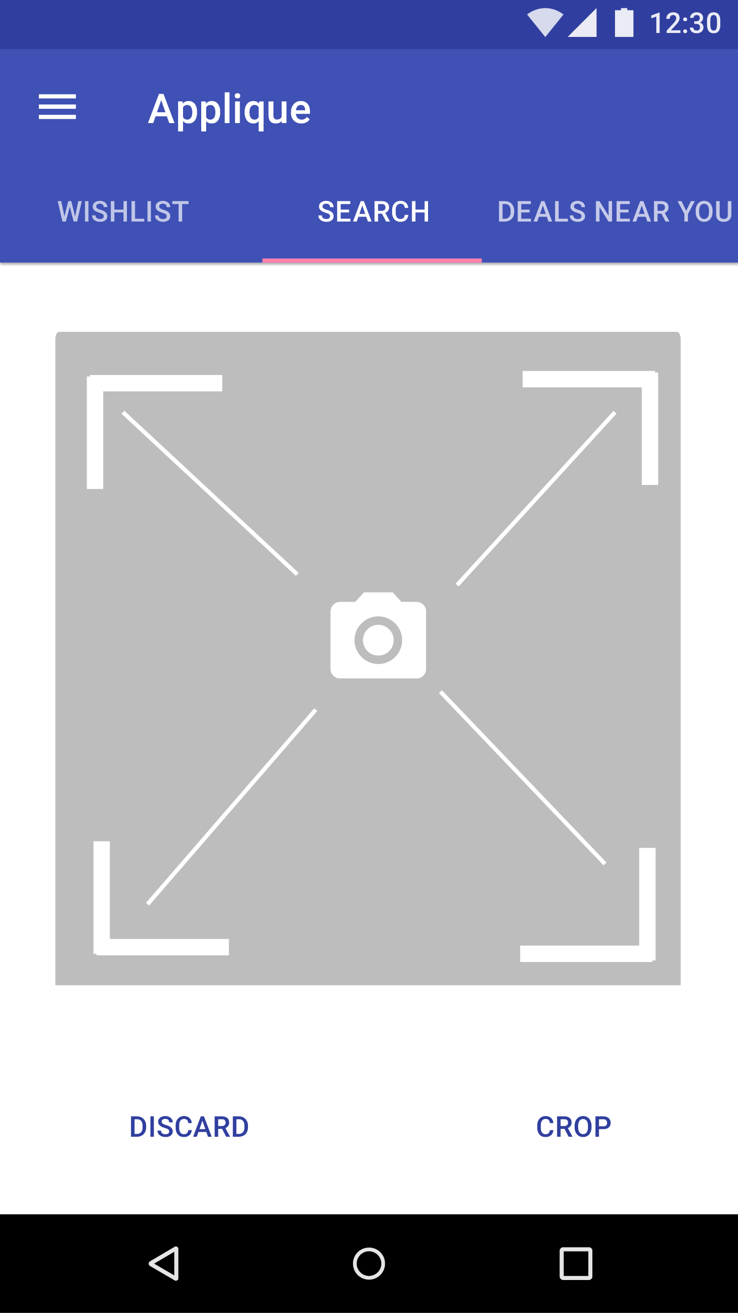
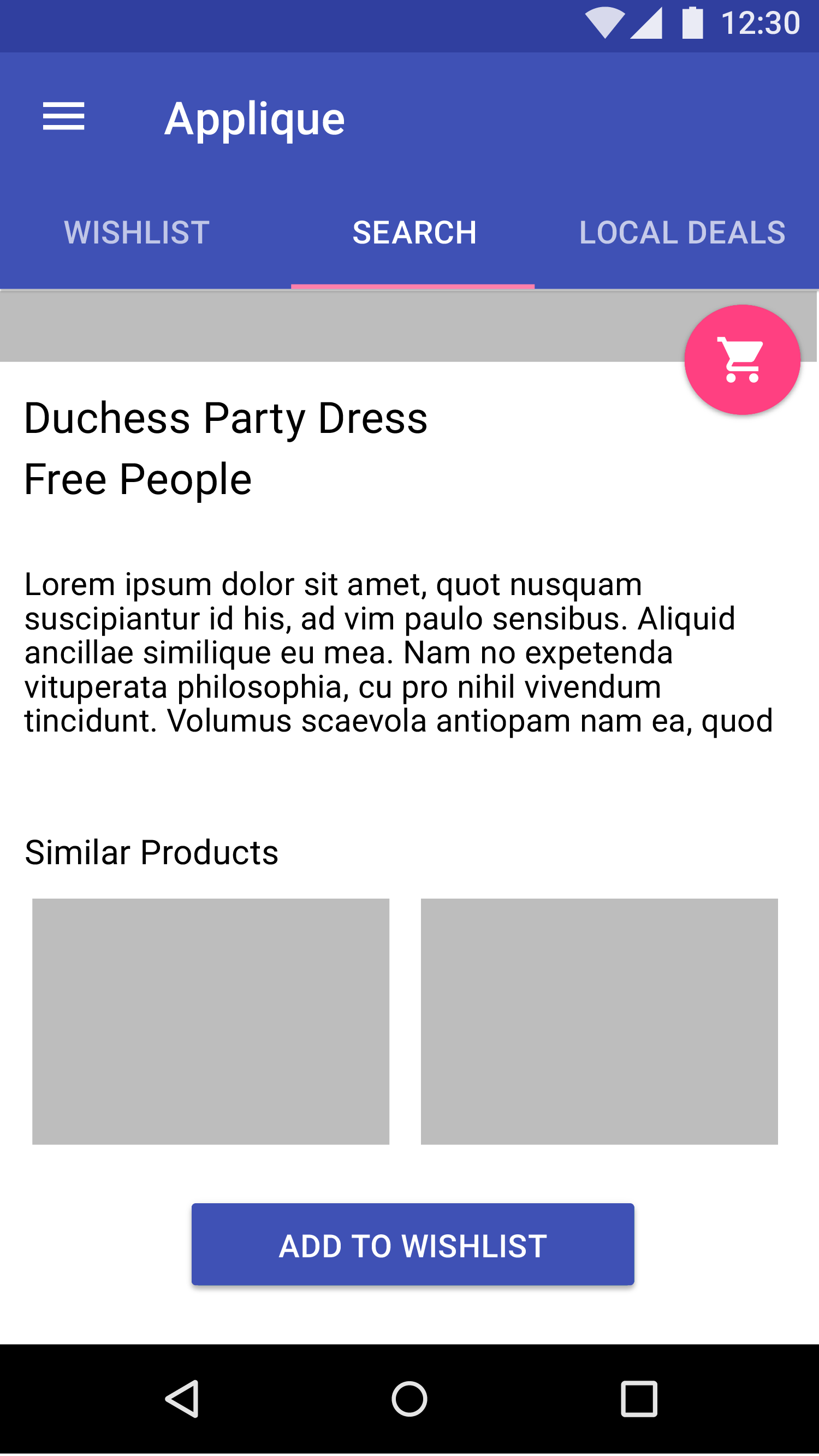
The Opportunity: The fashion industry, much like digital design and tech, thrives off of collaboration and inspiration. Applique is a fashion term meaning "a decorative design made of one piece of fabric which is then sewn on top of another"; or layering. Layering is not only a principle of design, is it indicative to who we are as creatives. Taking concepts of an original idea and forming personalized layers of thought based on experiences is a part of life, and Applique strives to nurture that feeling of individualism while keeping in mind that what matters most is that we help provide something that beautifully fits our community's and using it to do something powerful. I was responsible for creating the user experience , from conception, through research and iteration, all the way to visual design and production. Applique aims to create a personalized shopping experience based on real life interactions to take the pain out of searching for outfits and garments.
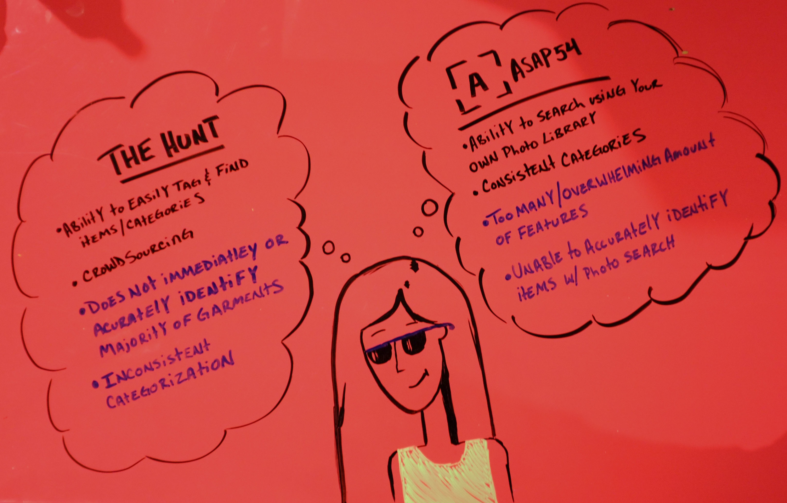
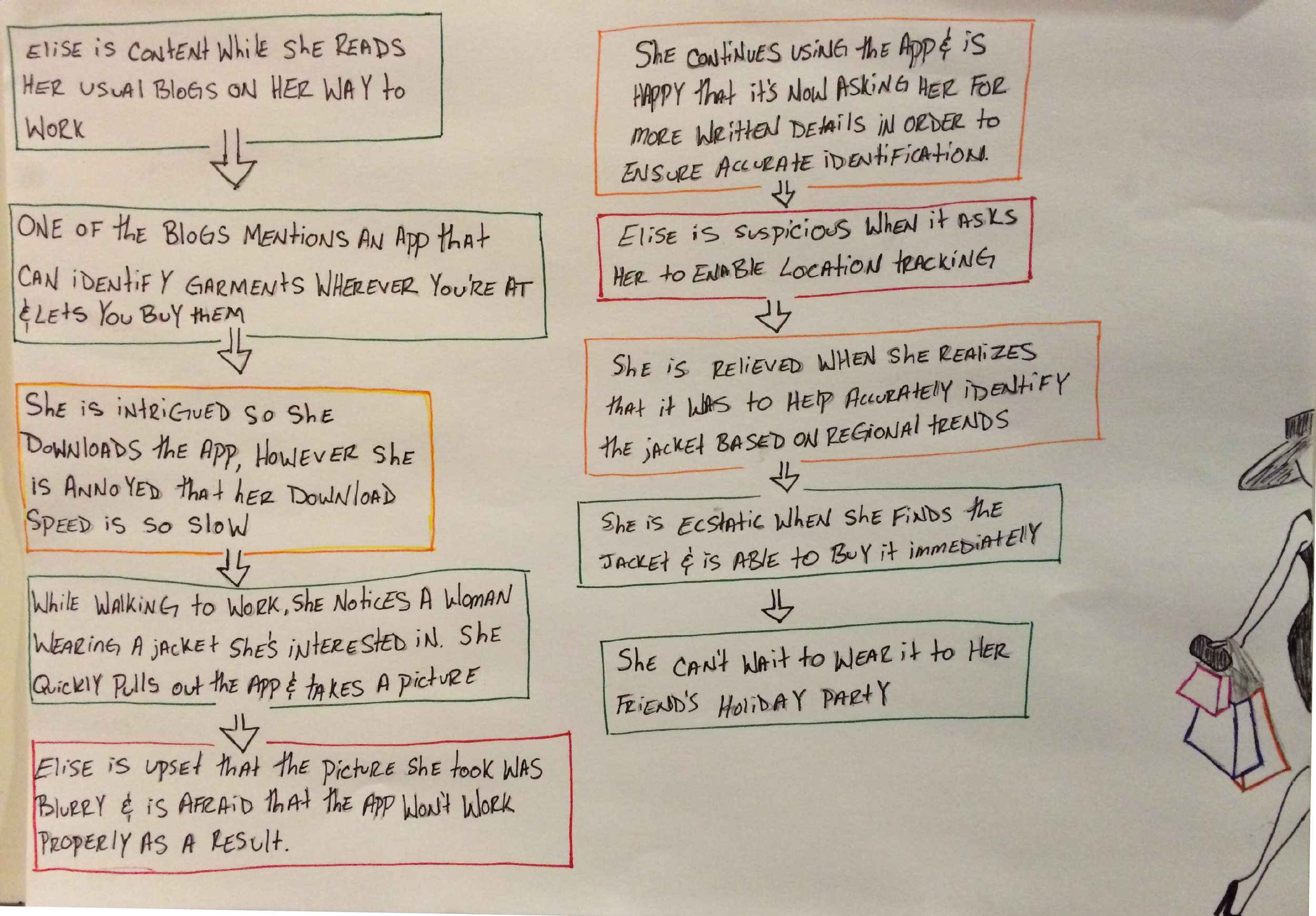
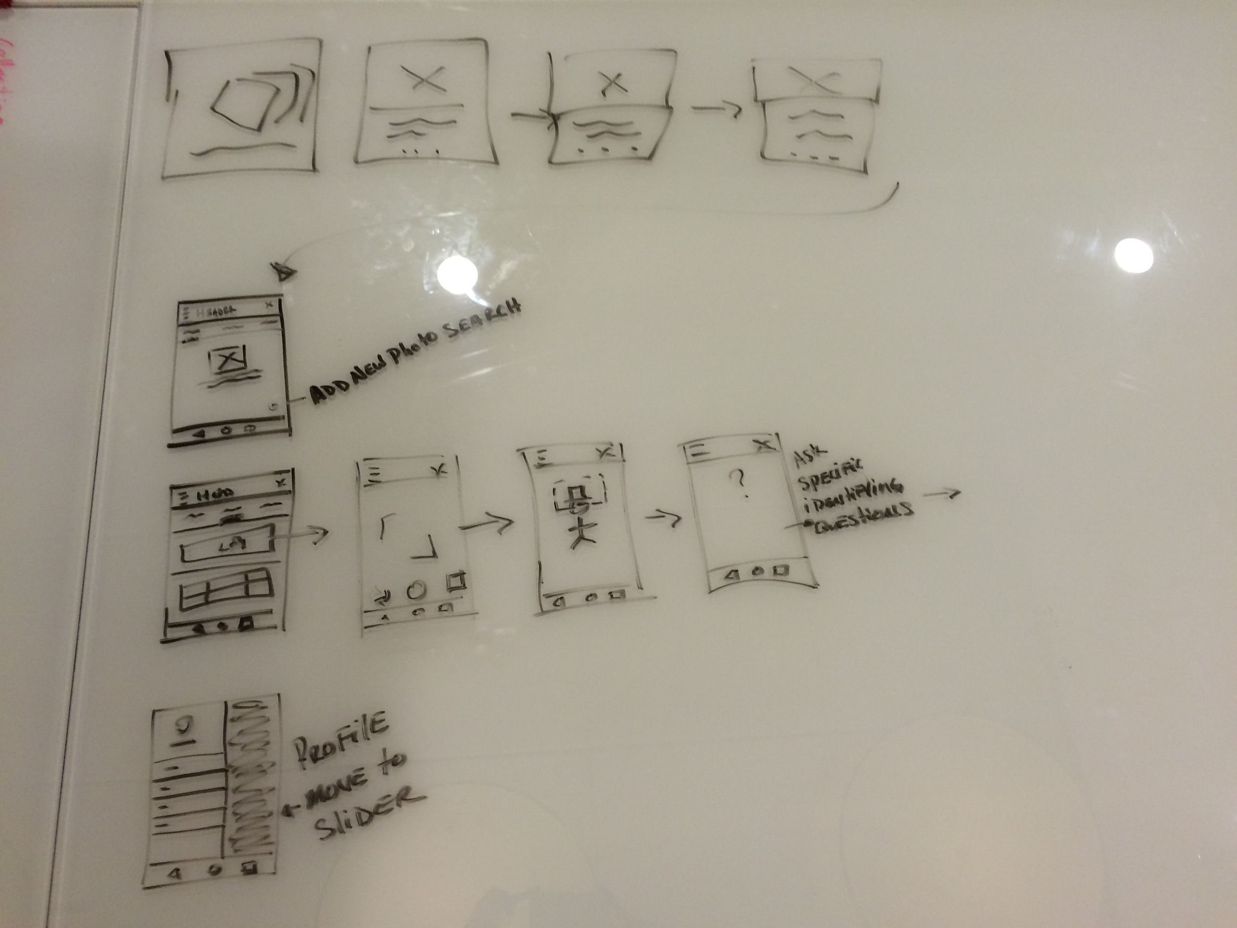
The Process: A critical component of design is identifying key users in order to provide contextually relevant experiences. I began by creating a persona which allowed me to fine-tune content. I created a journey map in order to develop empathy and insights into my users habits; to understand why they do what they do, how they experience interacting with the application through different touch points, and how I can better help them reach their goals. To get a clearer idea of the space, I did a competitive/comparative analysis on a few similar and current apps.
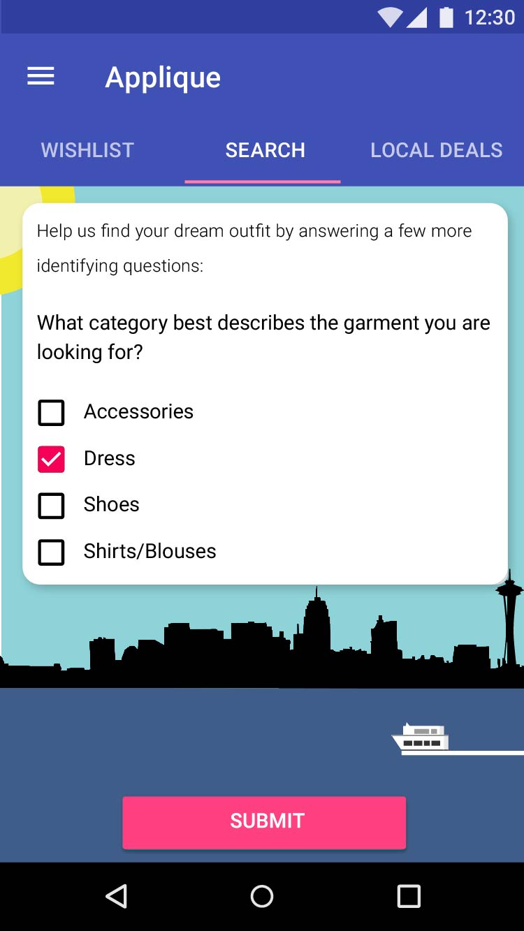
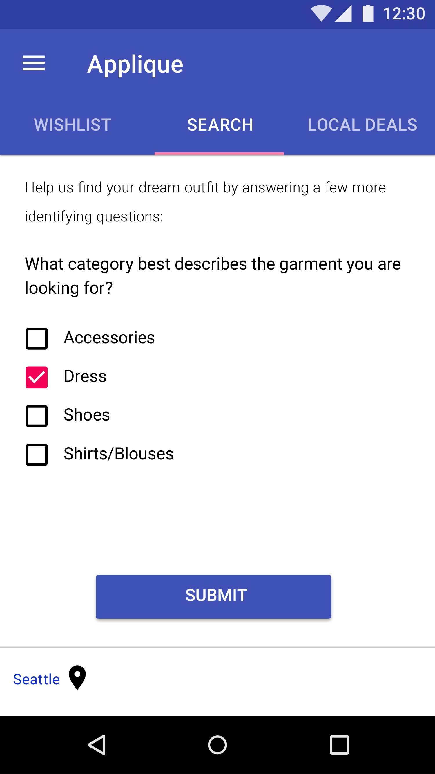
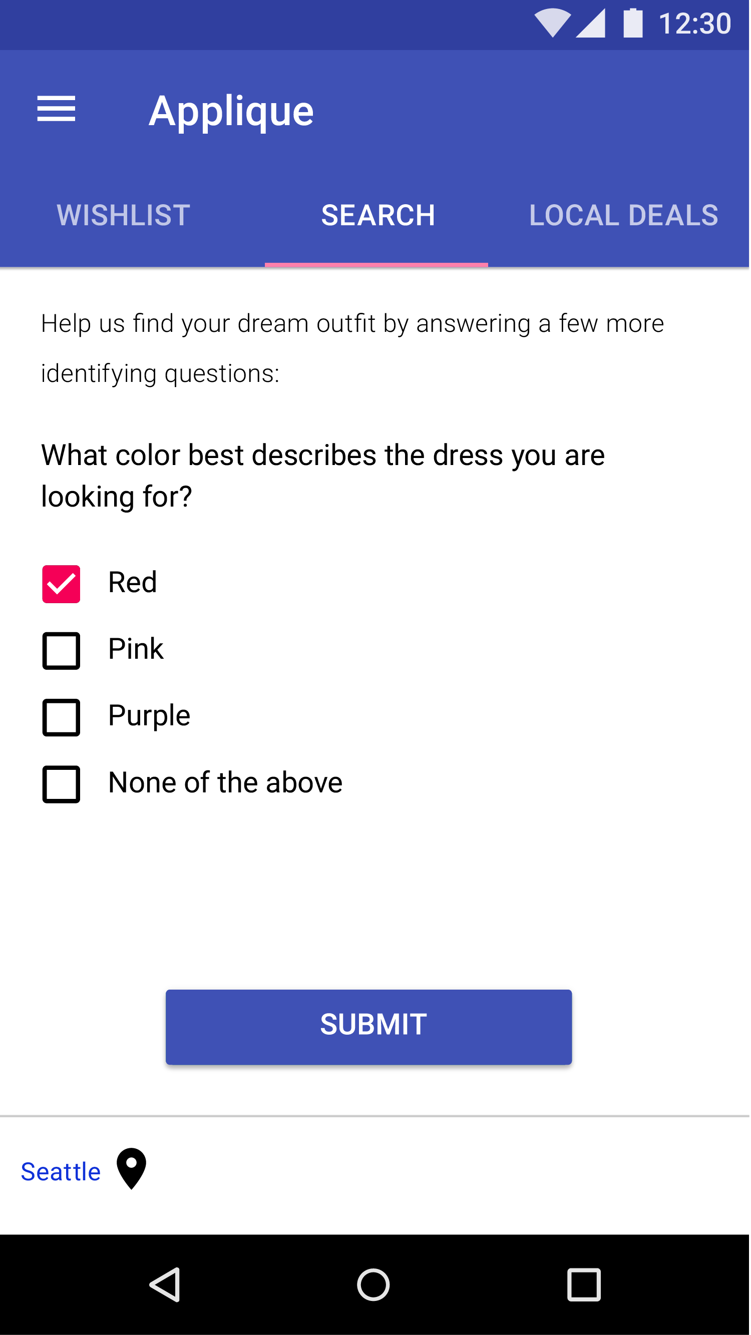
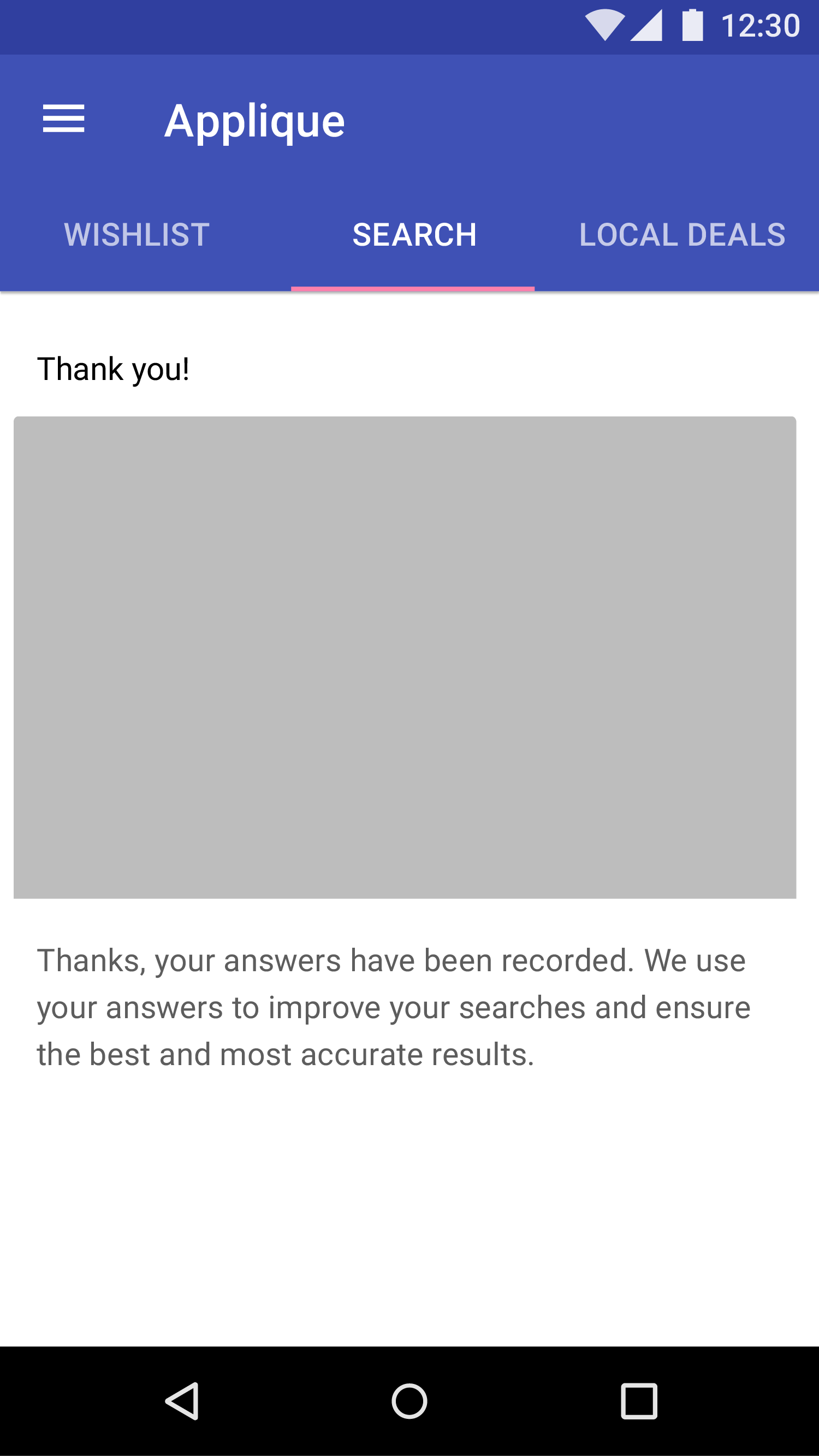
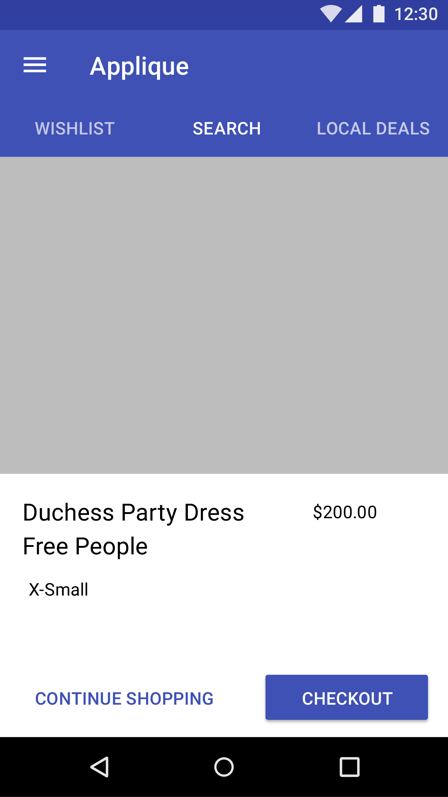
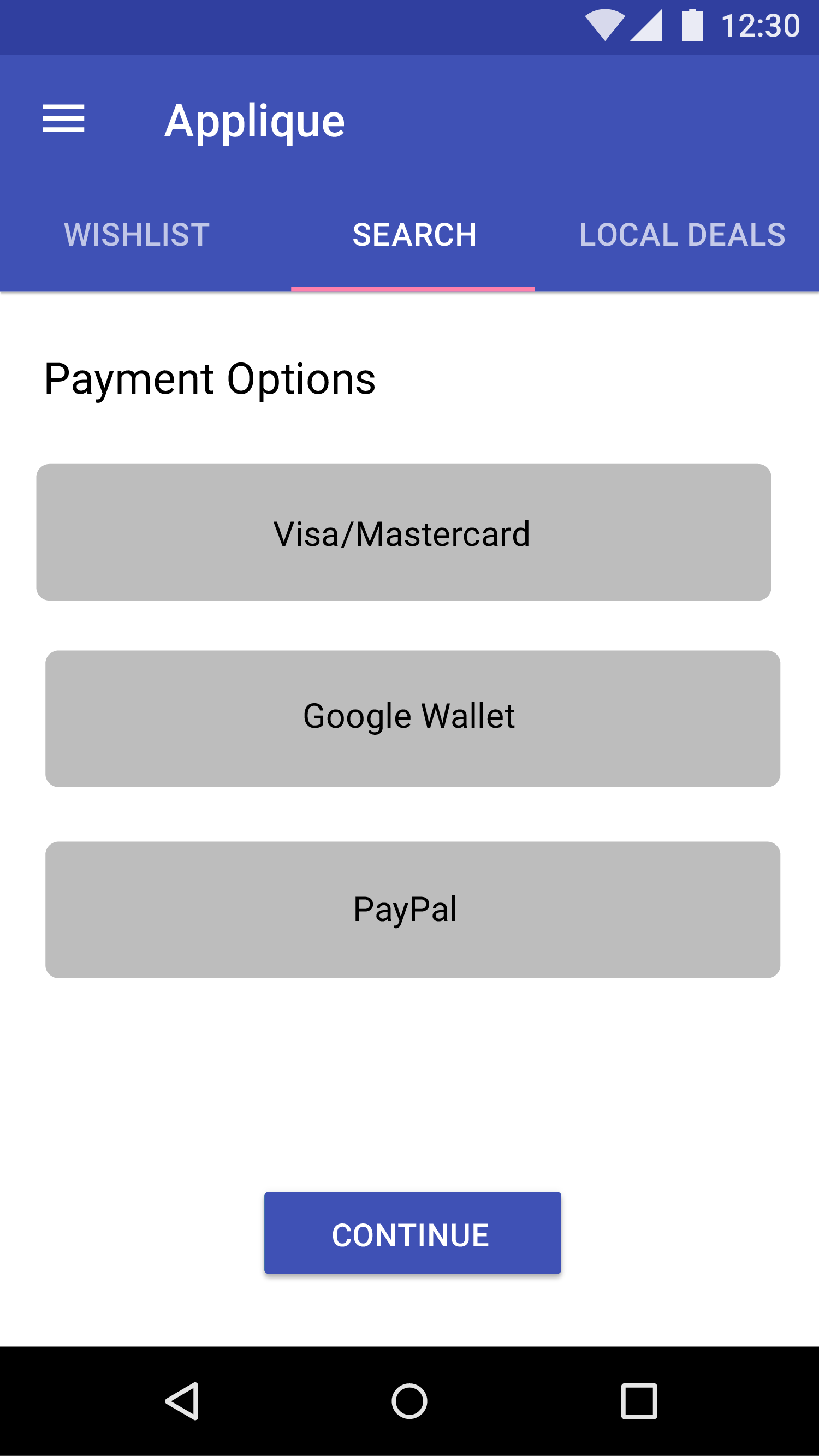
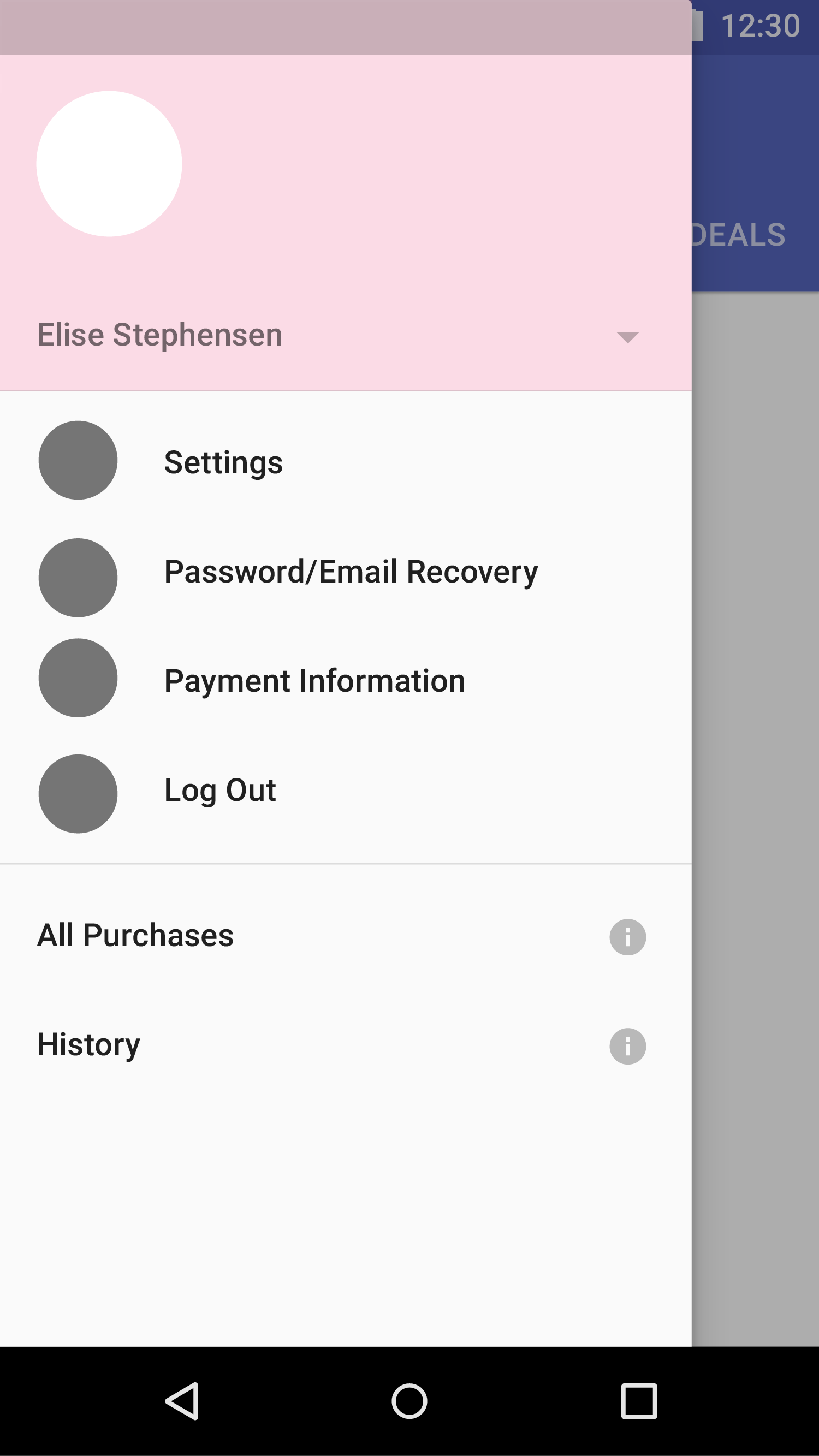
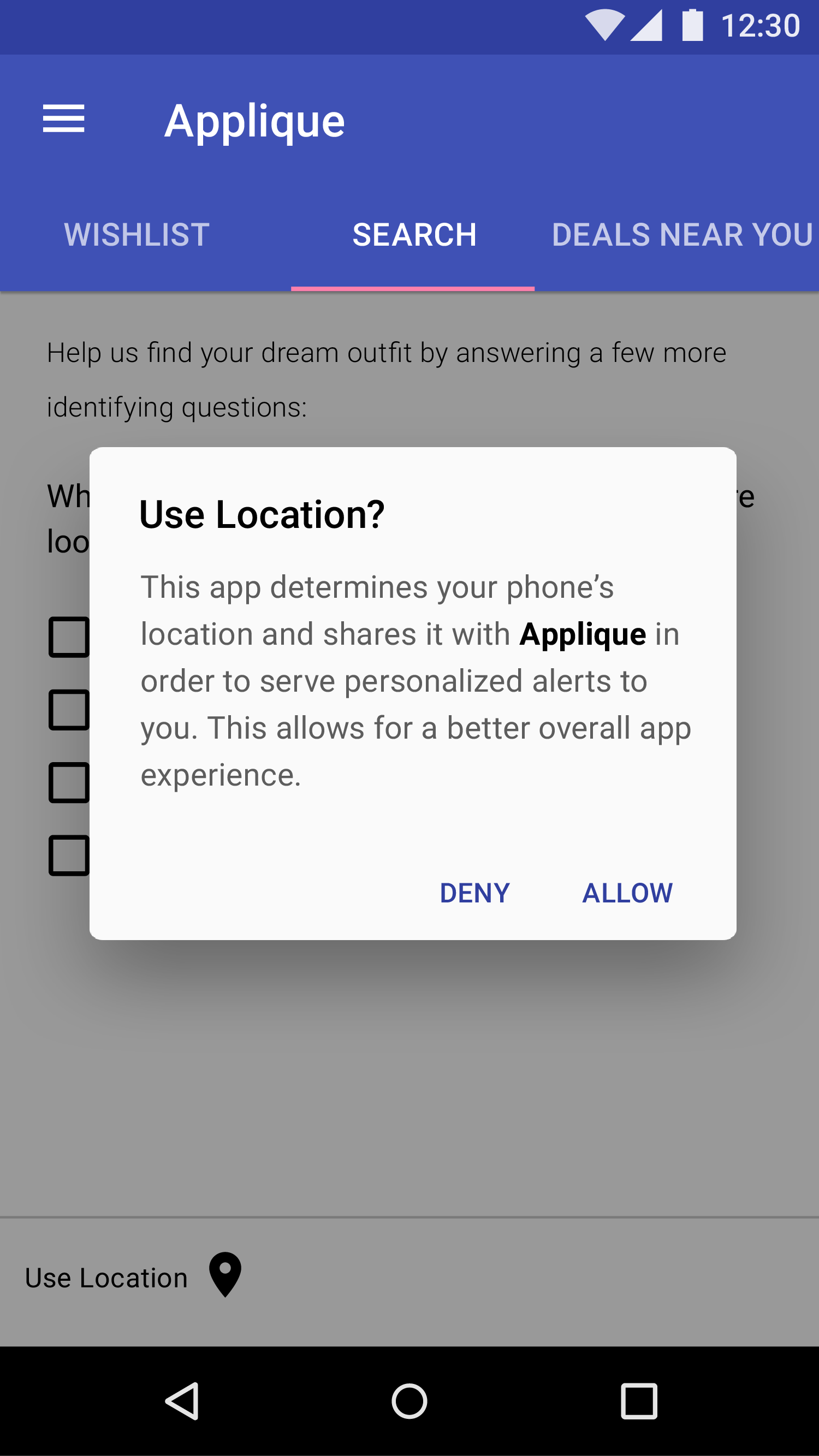
The Design: I leveraged Material Design in order to provide a seamless and familiar experience to my users, while establishing the trust and motivation to complete a purchase flow. During the checkout phase, the wireframes indicate an in-app web view, so as not to open a different browser page and break the flow all together. I wanted them to worry less about data input, and instead be excited about their new purchase. Additionally, I found that regional trends could help accurately identify articles of clothing in addition to images, so I included a location permission, not only to help identify trends and offer relevant information for search, but to build off of for further releases and versions (i.e location specific notifications and promotions) and emphasizing personalization over customization.
The Tools: Sketching, Illustrator, Axure


SMITH
UX/Visual Designer
The Opportunity: As a leader in engineering, surveying, construction, and architecture equipment & services, Cansel is planning for continued success with a web-based solution that would scale with their ever-growing business. As one of two UX Designers on this project, I was responsible for delivering an updated sitemap, a current and proposed content inventory, and updated wireframes to reflect a fully redesigned e-commerce platform.
The Process: Our goal was to provide Cansel customers with a modern digital experience that could respond to real-time business needs, and provide an e-commerce initiative that would empower their customers to more easily buy products & services online.
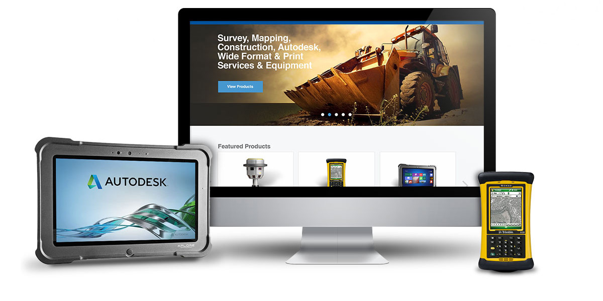
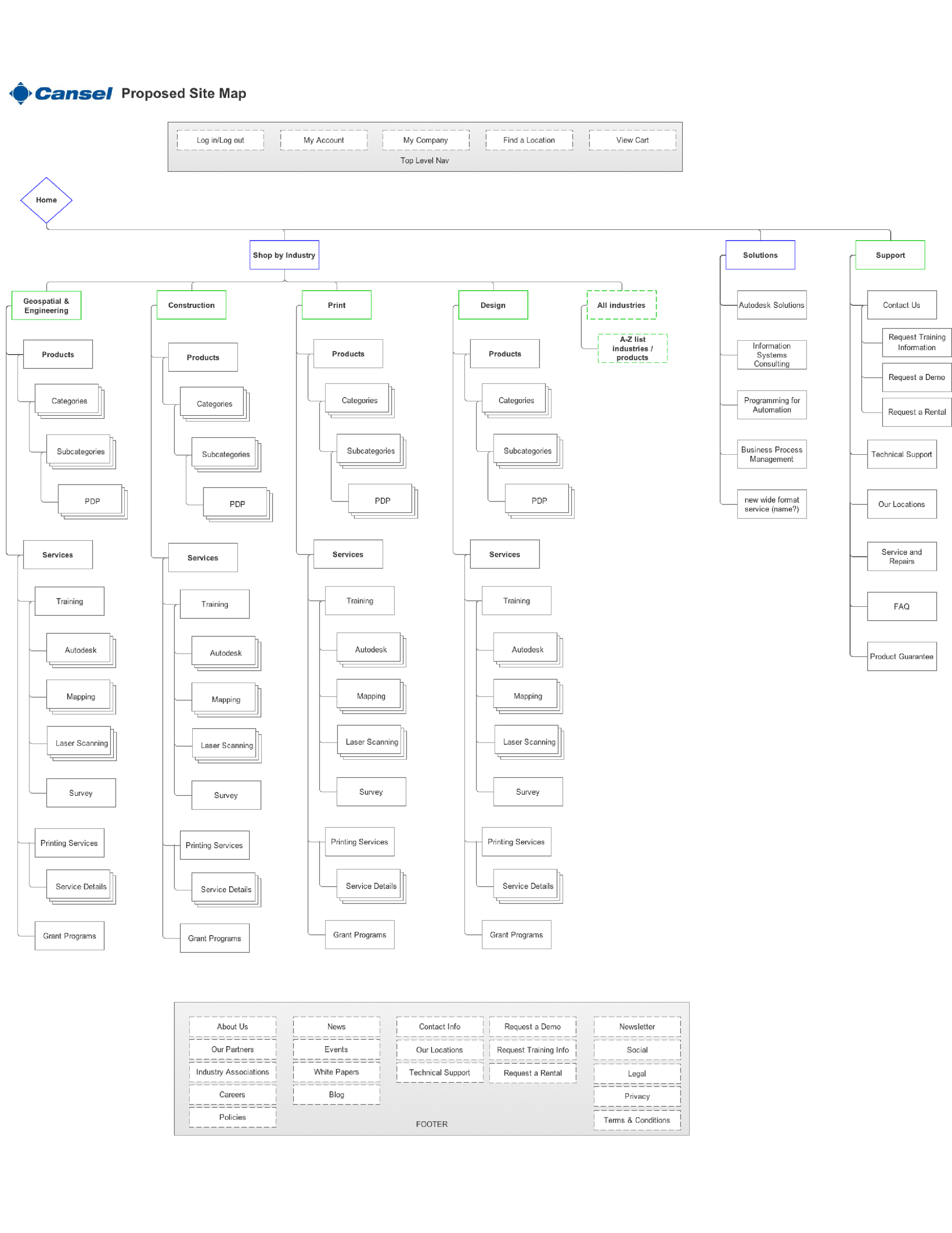
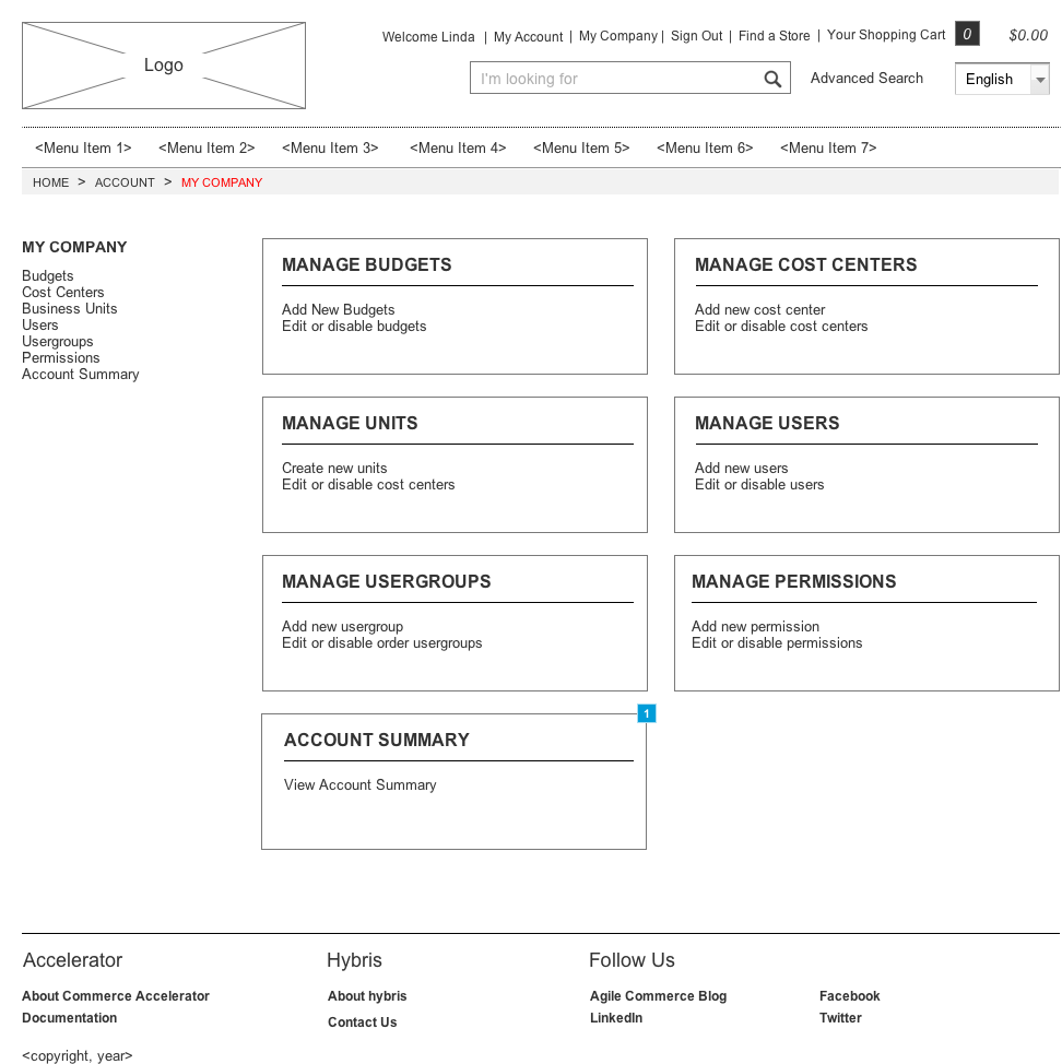
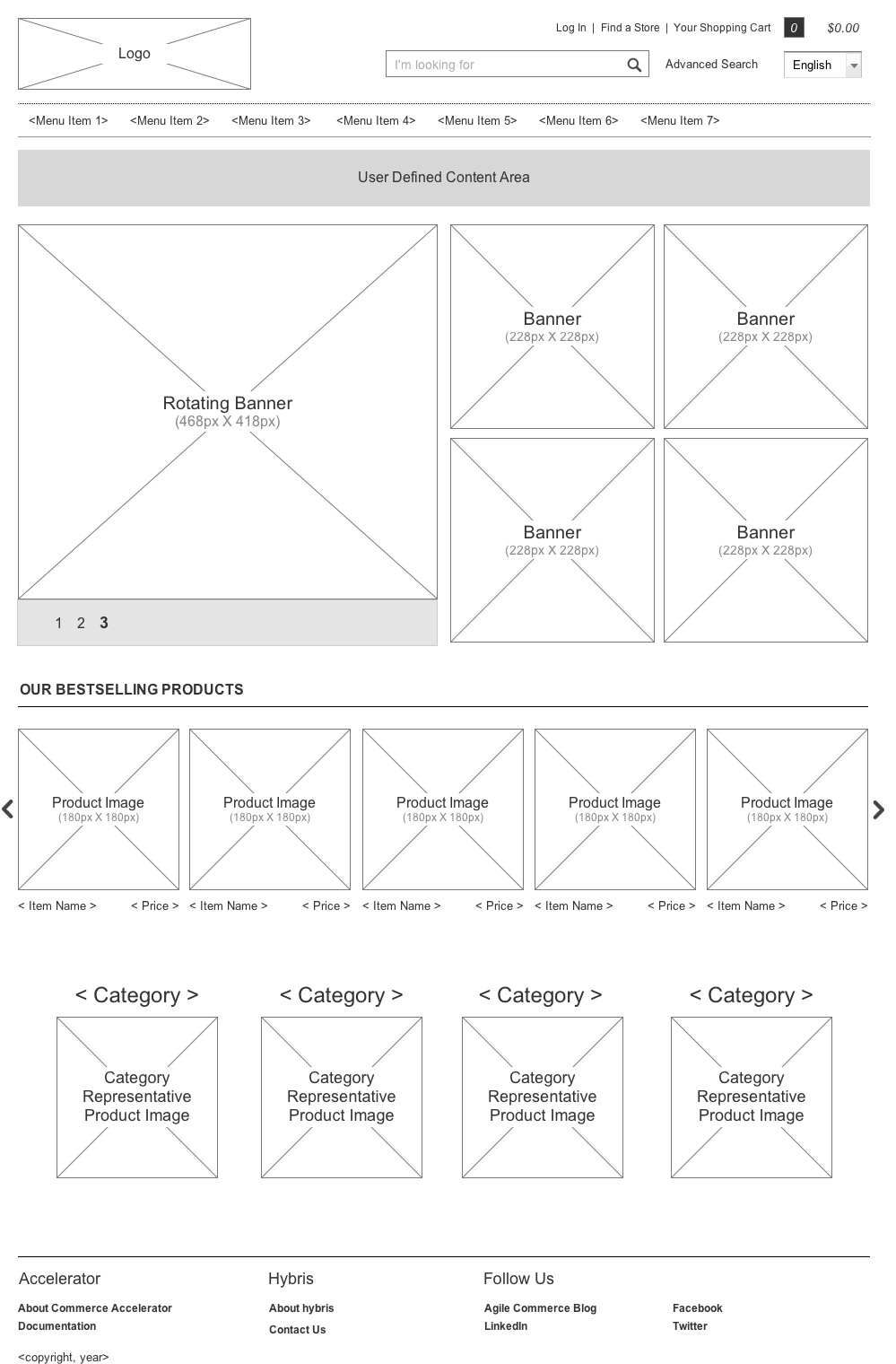
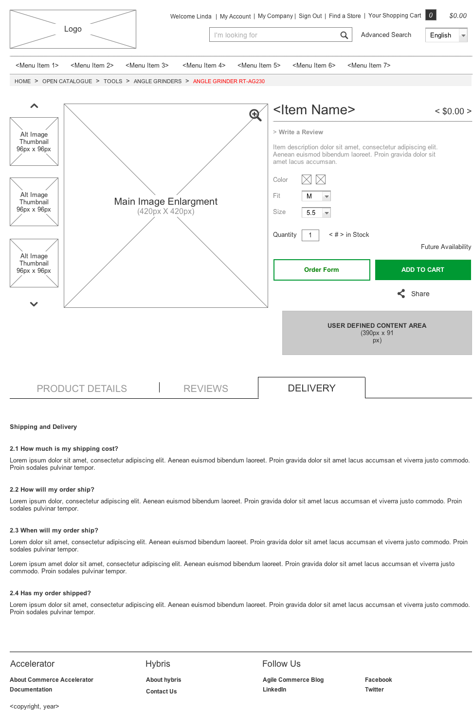
The Design: Our redesign will launch their B2B e-commerce platform on a SAP hybris from the ground up, including strategy, experience design, and post-solution support. The design solution will provide tools to help support new and existing customers through a smooth online purchasing experience, such as buying on account, account pricing, repeat orders, and optimization for internal approval process. In addition, our design will add value by ensuring consistent products & pricing, seamless order fulfillment, and ease of cross-selling. The new Cansel.ca site will be launched in 2016.
The Tools: Sketching, Axure
*As this project is still in development, please inquire about full visual design comps and mockups.

POSSIBLE
UX Architect
Responsive Web
The Opportunity: 2015 was the year of the wearable, and Microsoft marked the occasion with a release of Band 2. I was an Information architect and UX Designer for the Band marketing site, as created by POSSIBLE. It was a 3 month effort to create a deeper relationship and understanding of the Band's users all while keeping core consistency with Microsoft brand and familiarity.
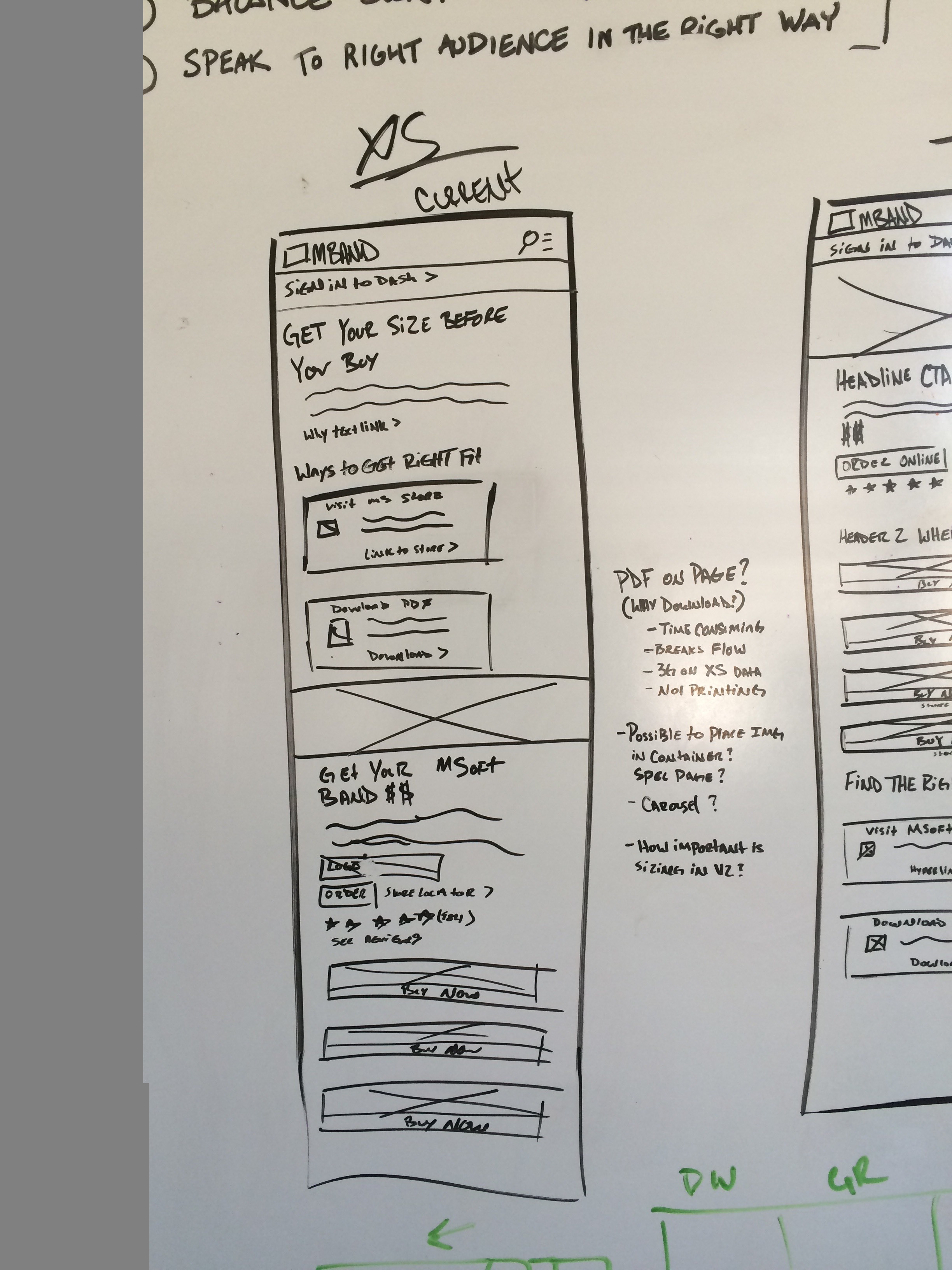
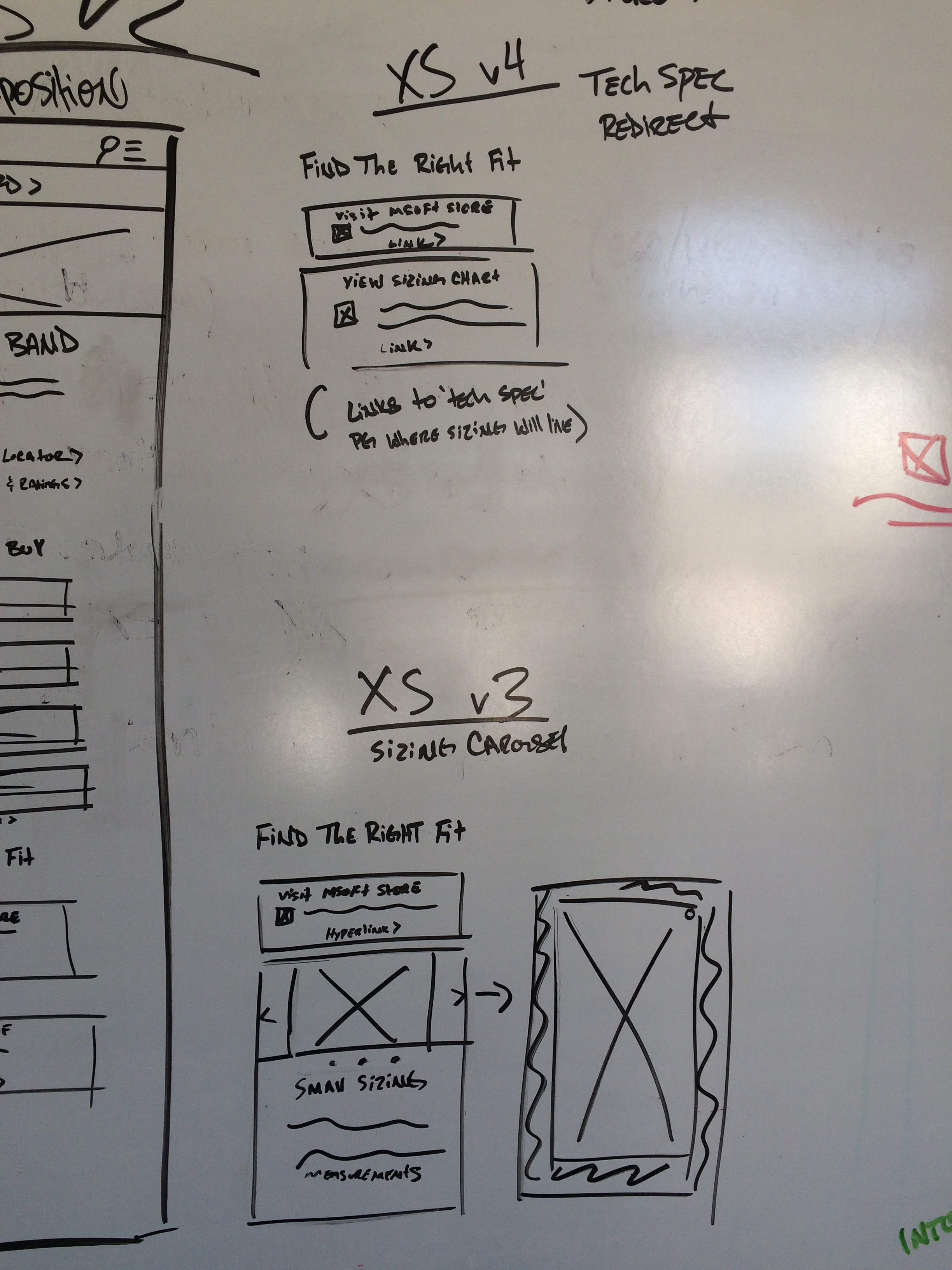
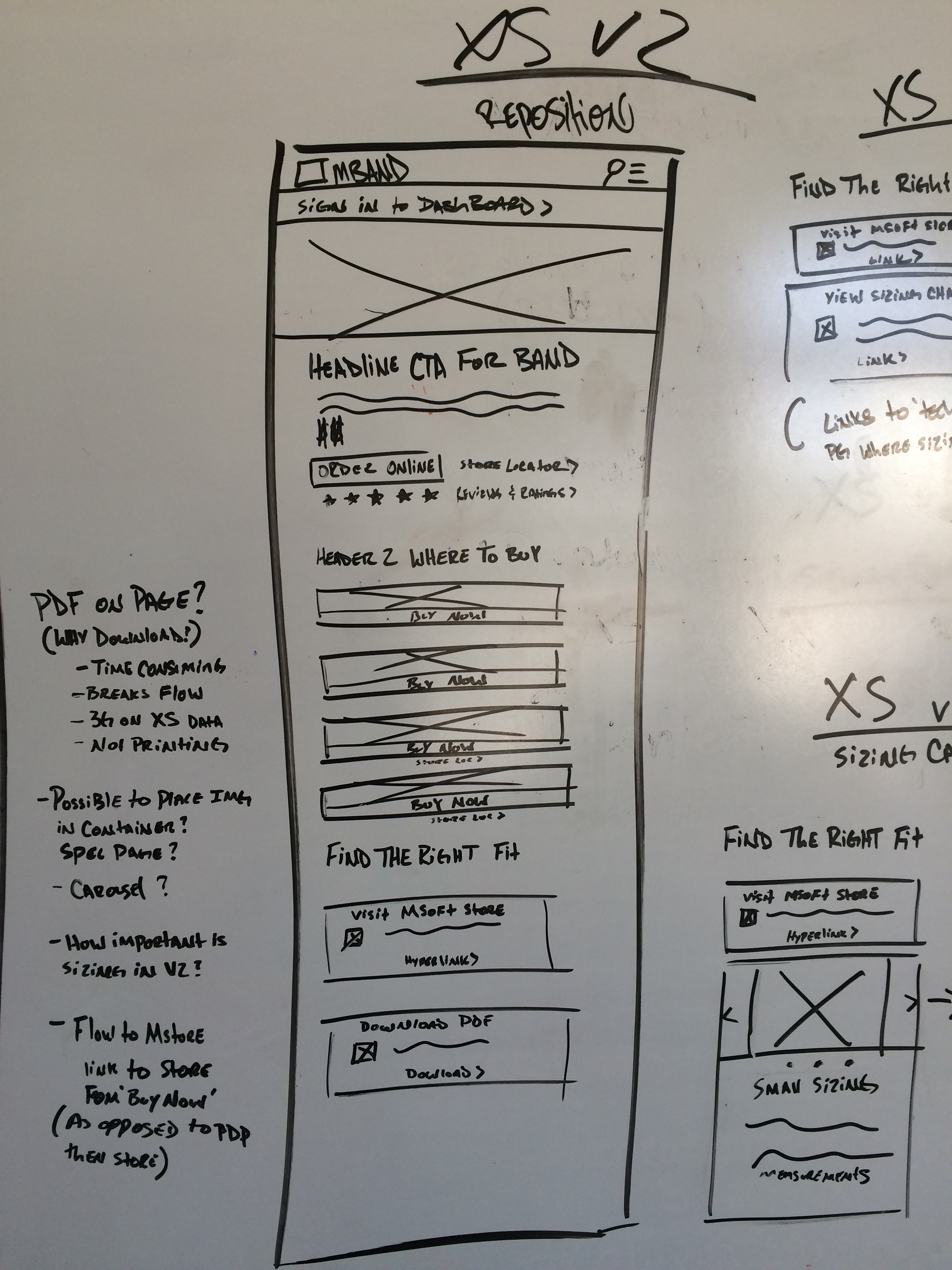
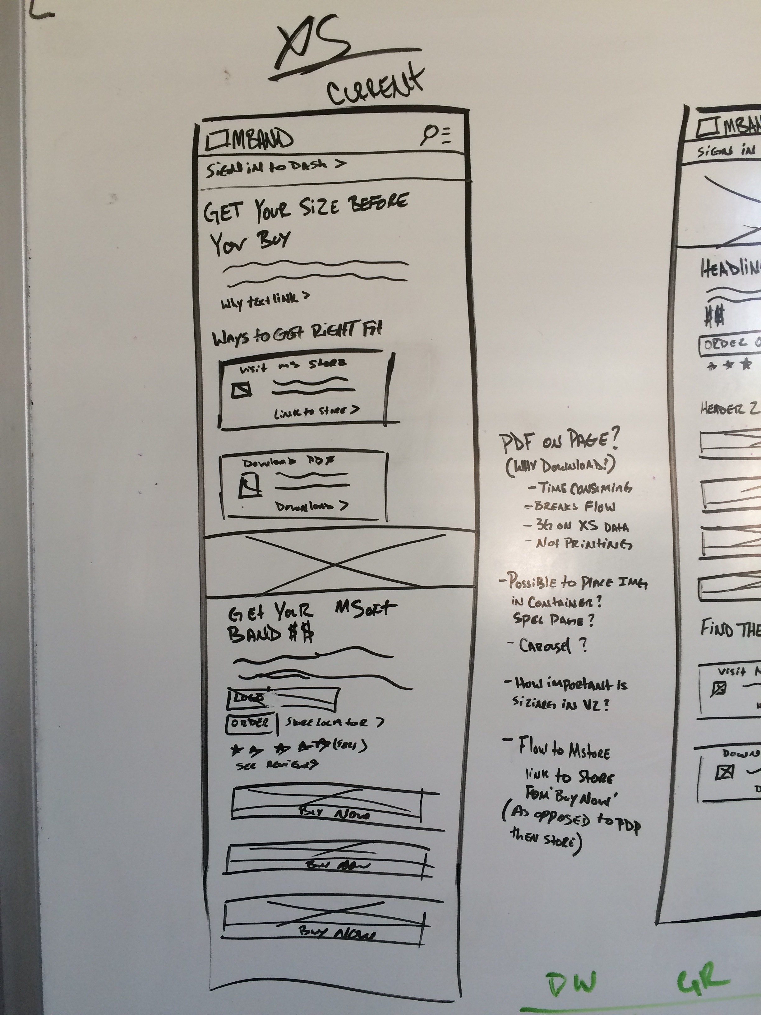
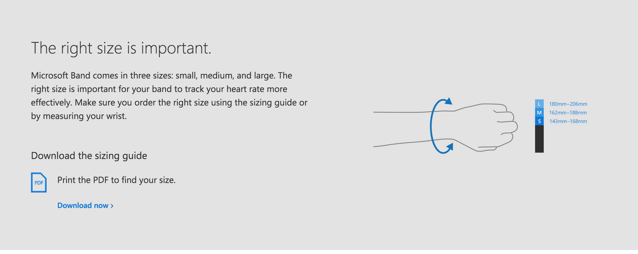
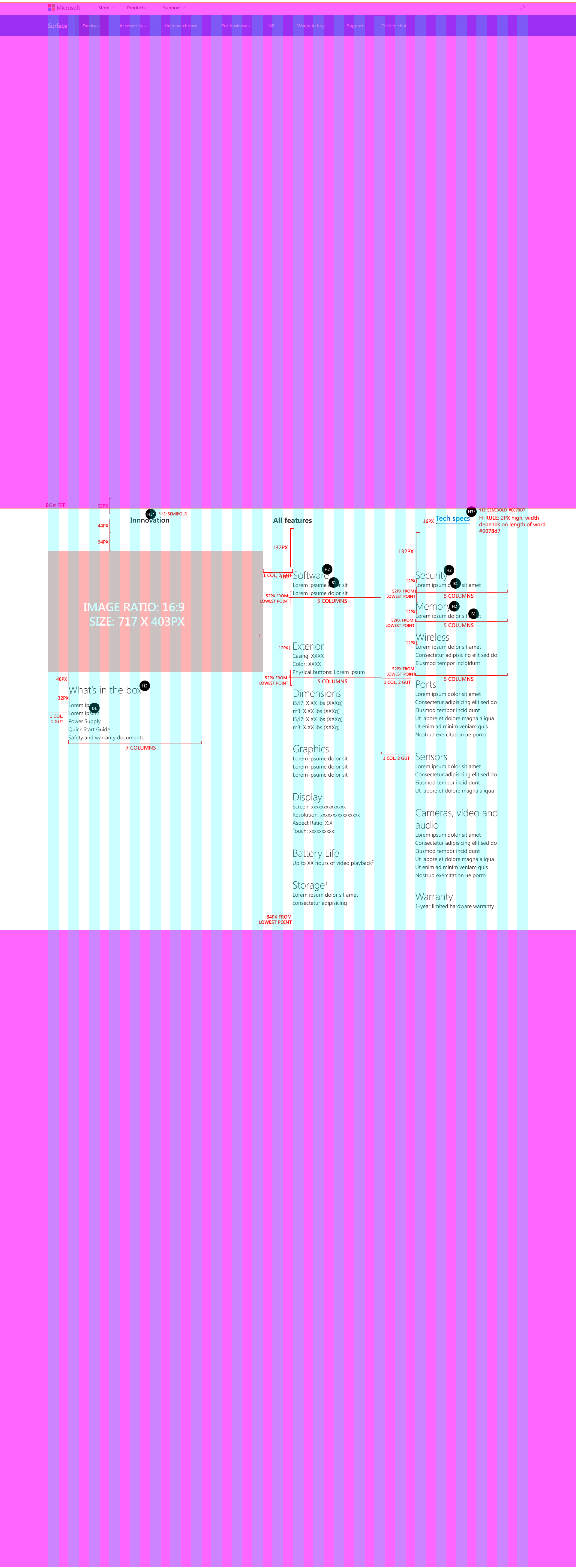
The Process: I worked alongside project managers, visual & production designers, and one other lead UX designer to evangelise business with customer goals. I executed wireframes, sketches, and design specs and lead design on the 'Partners & Apps', 'PDP', and 'Tech Spec' pages. With a fixed deadline and large scope, we immediately felt time and coordination challenges. We alleviated a lot of frustrations by creating (and sticking to) a well balanced design/production driven sign-off process and daily stand-ups.
The Design: During stand-ups, I learned from our content strategy teams that information obtained through research of the first release of Band surfaced main interests in using the wearable to connect with current apps customers use and for productivity (i.e. emails, calendar notifications) purposes. I took that opportunity to highlight new Windows10 apps at the forefront of the "Partners & apps" page along with highlighting most used apps to ensure discovery and that users most beloved apps will be available on the new Band 2. Our team also made the decision to bring attention to our knowledge of the end user by using imagery and hero images that presented core themes, not only for Microsoft, but for our customers, first and foremost. In addition, I also created a UX Panel Library that combined all of the layout and design spec information across Microsoft Product teams in order to quickly and accurately implement further designs, in the future.
The Tools: Illustrator, sketching

Broad Street Maps
UX Designer & Researcher
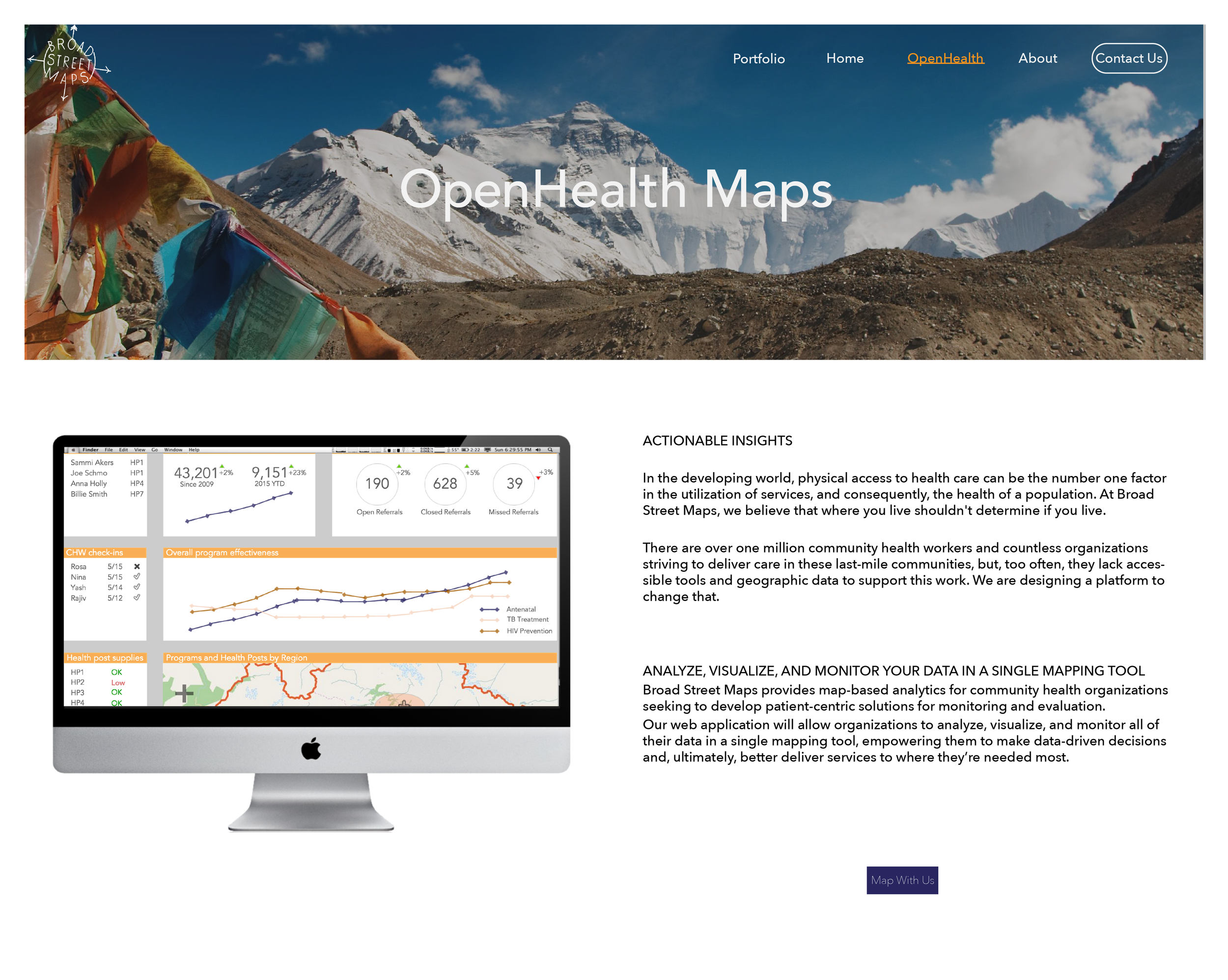
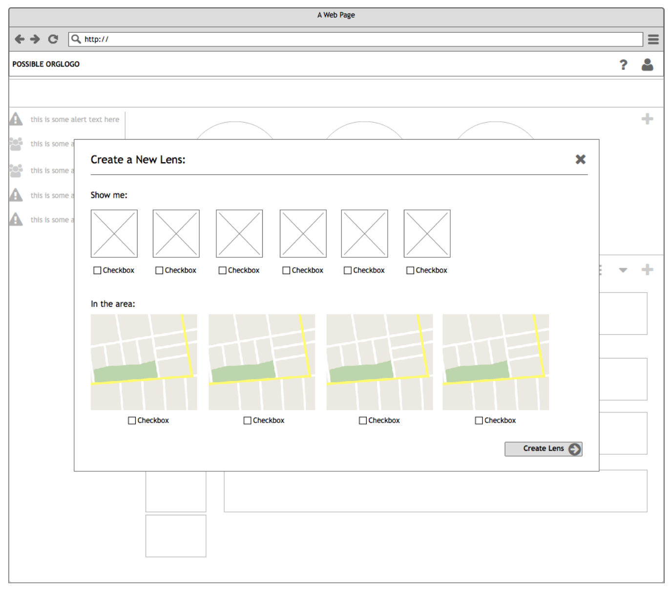
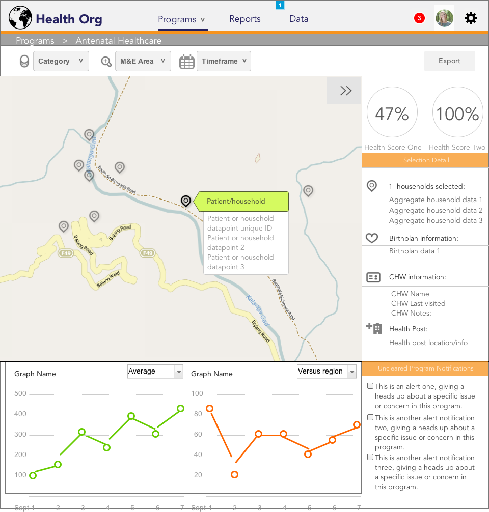
The Opportunity: Broad Street Maps provides map-based analytics for community health organizations seeking to develop patient-centric solutions for monitoring and evaluation. Our web application will allow organizations to analyze, visualize, and monitor all their data in a single mapping tool, empowering them to make data-driven decisions and, ultimately, better deliver services to where they're needed the most.
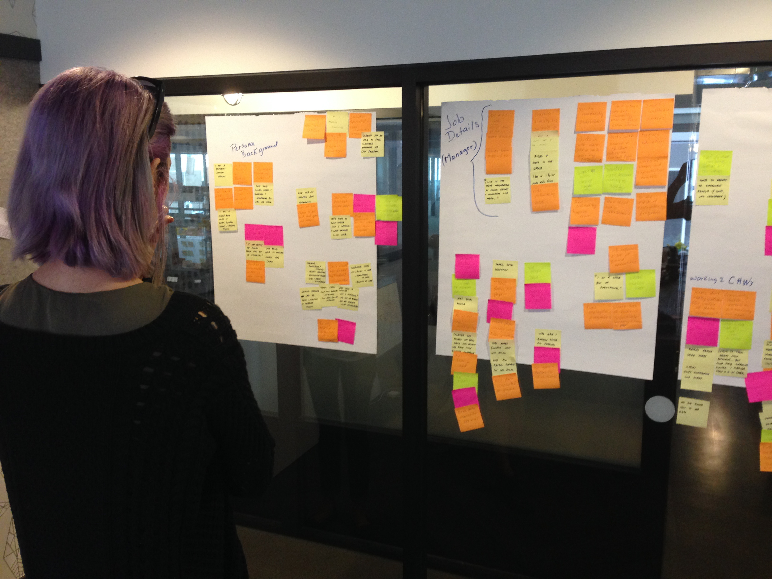
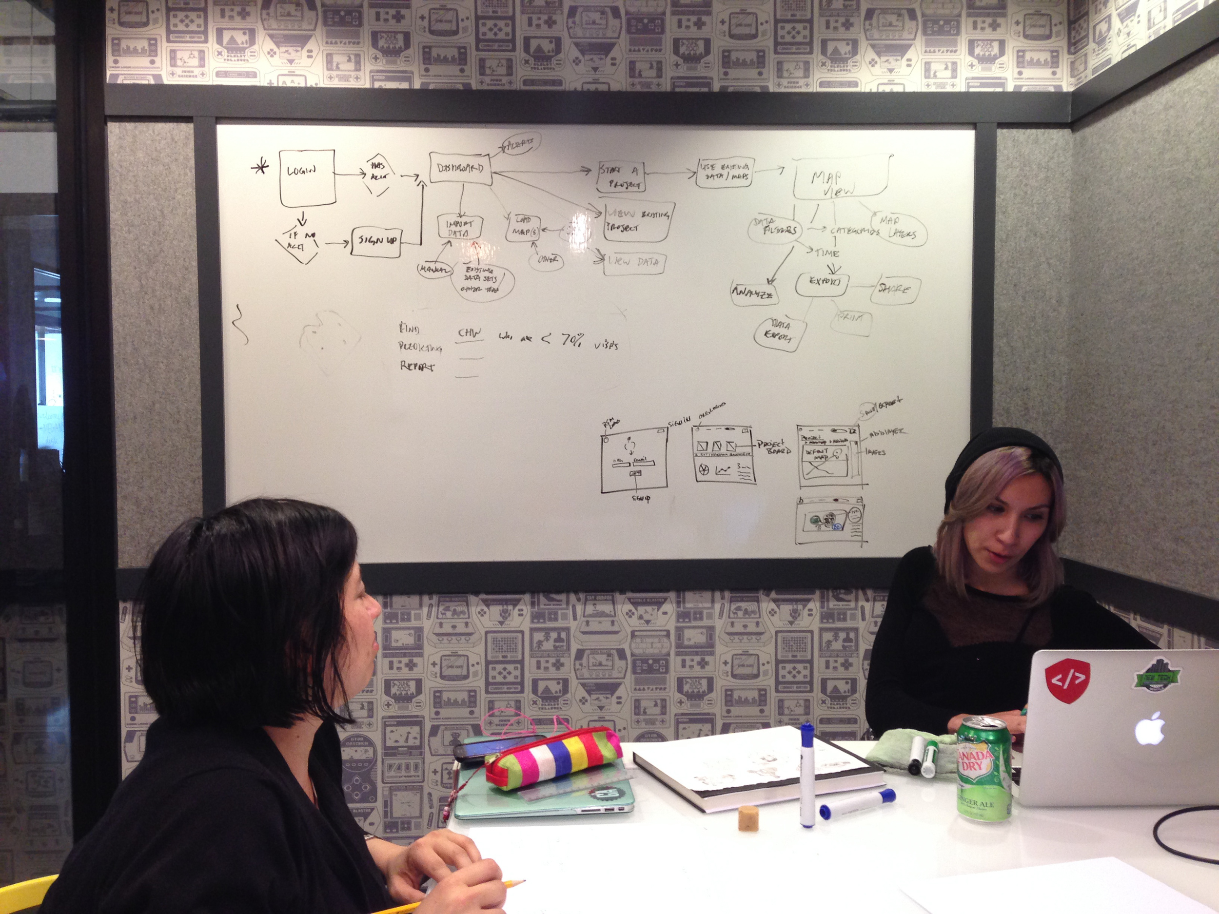
The Process: We began by identifying our users as mostly tech savvy, college graduates working with NGO's in rural areas and conducting interviews over the span of five different timezones in order to hone in on specific user needs. After gathering enough information from our interviewees, we were able to create an accurate persona representation to guide the rest of our design process from affinity diagraming, to early stage sketching and wireframes, and lastly, our clickable prototype.
The Design: Our initial sketches attempted to satisfy the need for easy-to-access statistical data, however we quickly realized that too much data is often overwhelming even to the most advanced technical users. Upon multiple user tests and iterations, we replaced heavy visual data with notifications and predefined graphs so that patient data was easily accessible, but not overwhelming. There was also the addition of a modular dashboard in order to customize to the users specific needs at any given time.
The Tools: Sketching, Balsamiq, Illustrator, Axure
New Product Page

meld
Interaction/Visual Design
Mobile iOS & Android


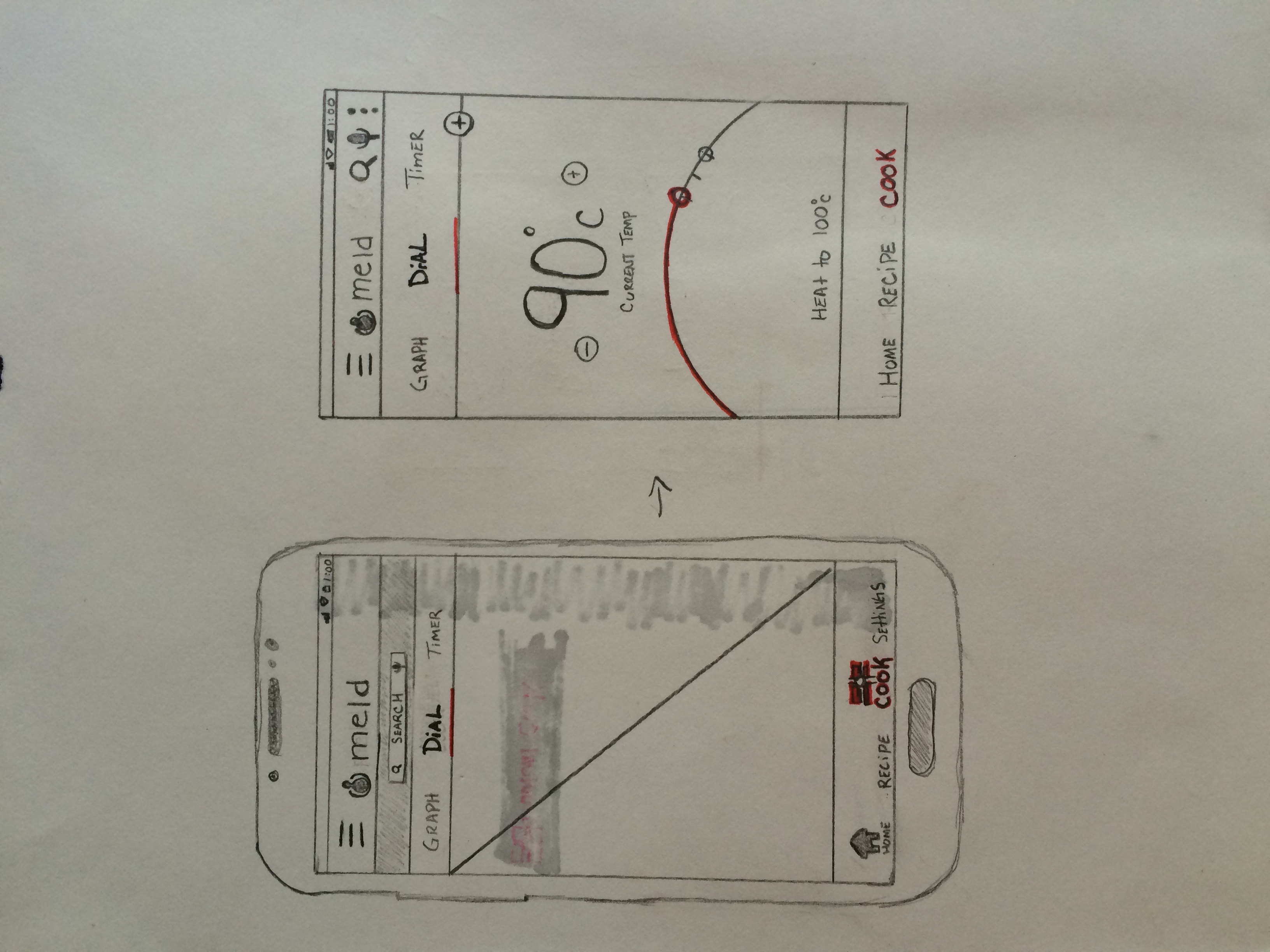


The Opportunity: The Meld Knob is an automated knob for your existing cooktop, and it wirelessly communicates with a precision temperature sensor that attaches to your cookware. Coupled with the mobile app, it hopes to ensure perfect cooking temperature with every meal. During my time at meld, I was to create a cohesive and familiar mobile experience to complement the physical product, and visual assets for marketing and promotional purposes.
The Process: I began by creating a detailed user flow and site map, while doing in-depth research and analysis to iOS and Material Design practices to maintain familiarity and consistency. I conducted user testing with both the physical product and native mobile app.
The Design: The greatest challenge proved to be creating a UI and temperature dial that felt familiar to the user while retaining usability for precise temperature setting. I found that a majority of early stage designs were difficult to define precise temperature settings manually, and ultimately ended up developing a dial that resembled a physical dial on modern stove tops.
The Tools: Sketching, Photoshop, Illustrator, Axure

Zamplebox
Visual/UX Designer
Responsive Web


The Opportunity: At Zamplebox, I was responsible for seeing projects from a high level and how it fit into an overall service, while also considering the fine details of User Interface components, labels, and flows to help users achieve their goals. I supported the conceptual development, direction, and delivery of final visual designs, across all platforms, for our site and partner sites. I contributed to and owned the visual design aspect of projects and pitches while maintaining a user-centered focus.
The Process: I approached project challenges with a focus on interpreting/developing the client’s brand whilst also communicating our clients’ message in an engaging and creative way. I continued to apply and communicate solid rationale as part of the creative process and at all times execute to the highest standards.
The Design: Deliverables included sketches and a prototype to redesign Zamplebox's checkout process, graphic/print design assets for marketing and promotional purposes, responsive web design for partner sites, and social media design content.
The Tools: Sketching, CSS/HTML, Illustrator, Photoshop, InDesign, Balsamiq

Yelp
Mobile iOS
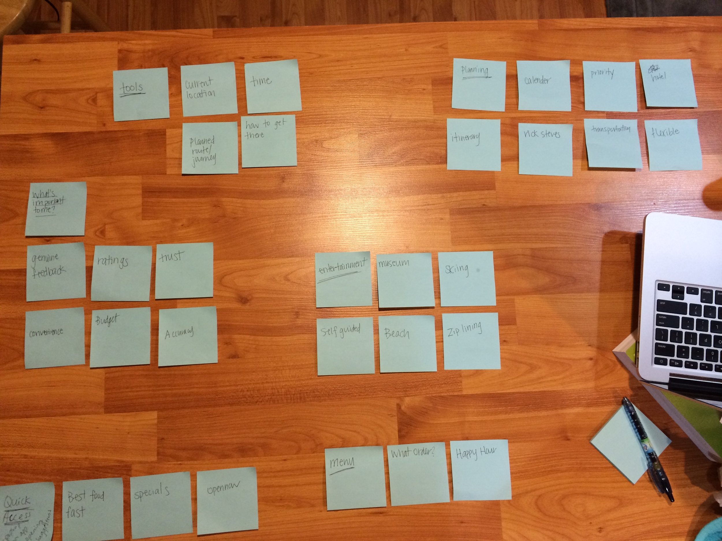
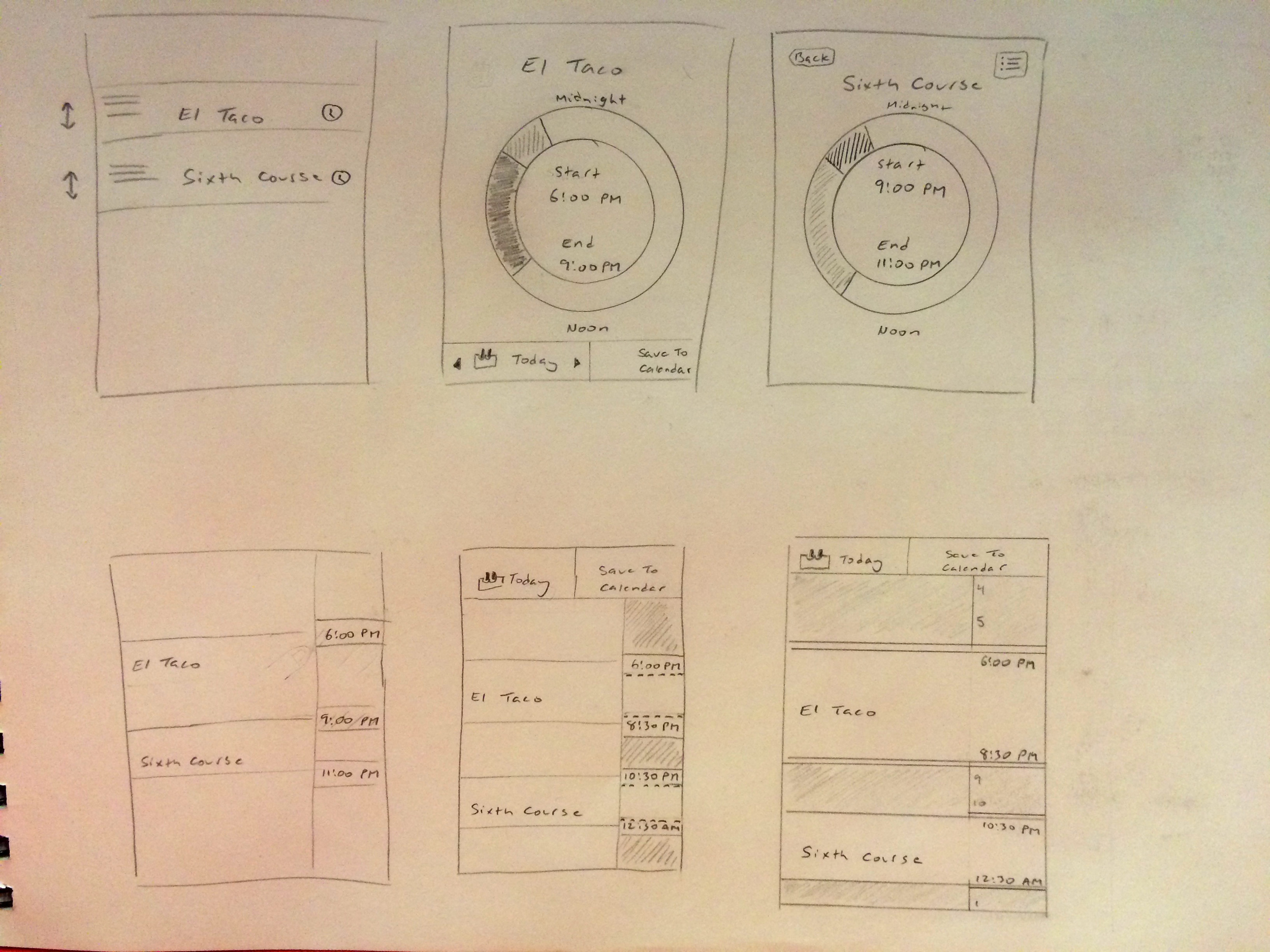
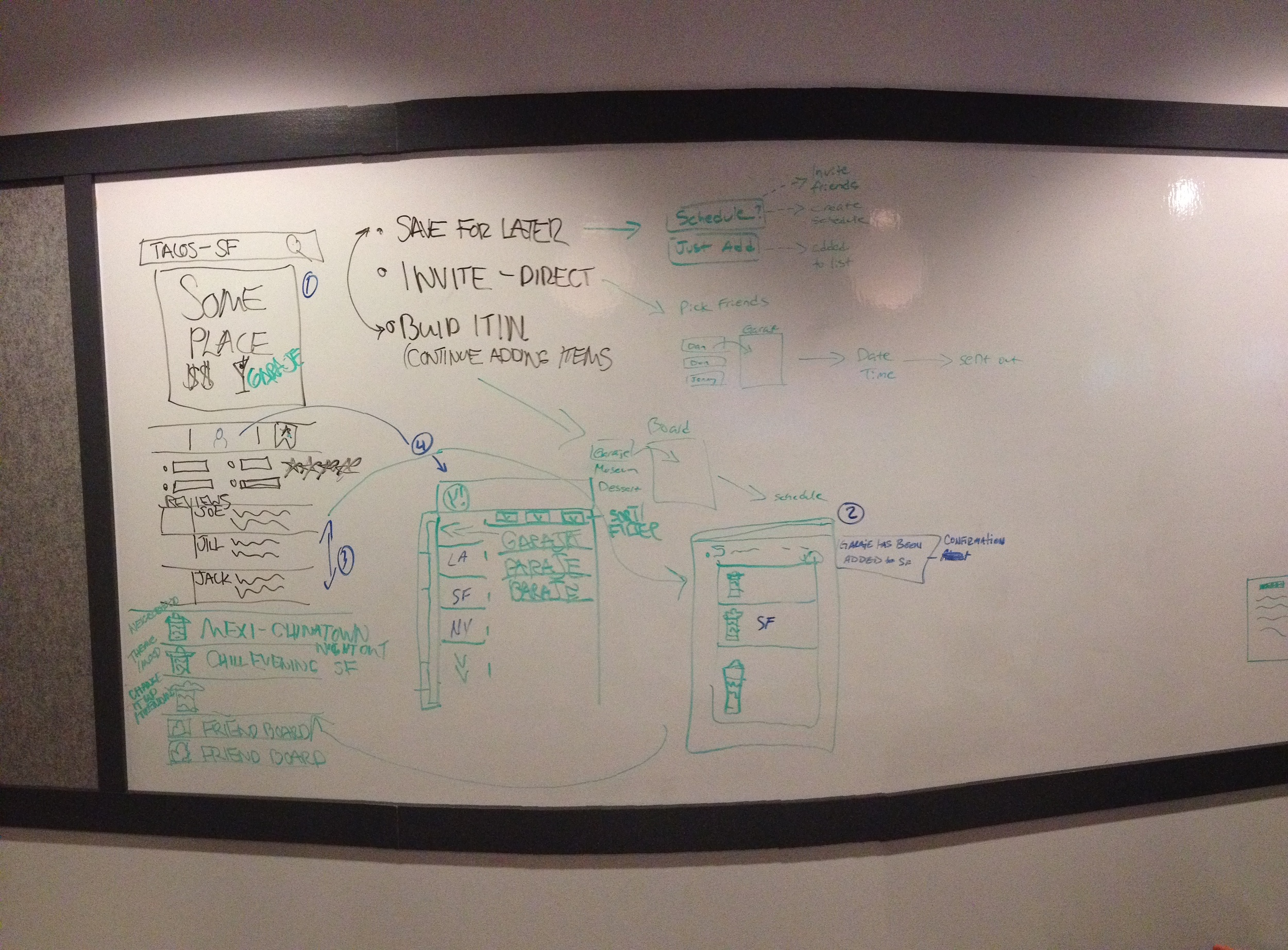
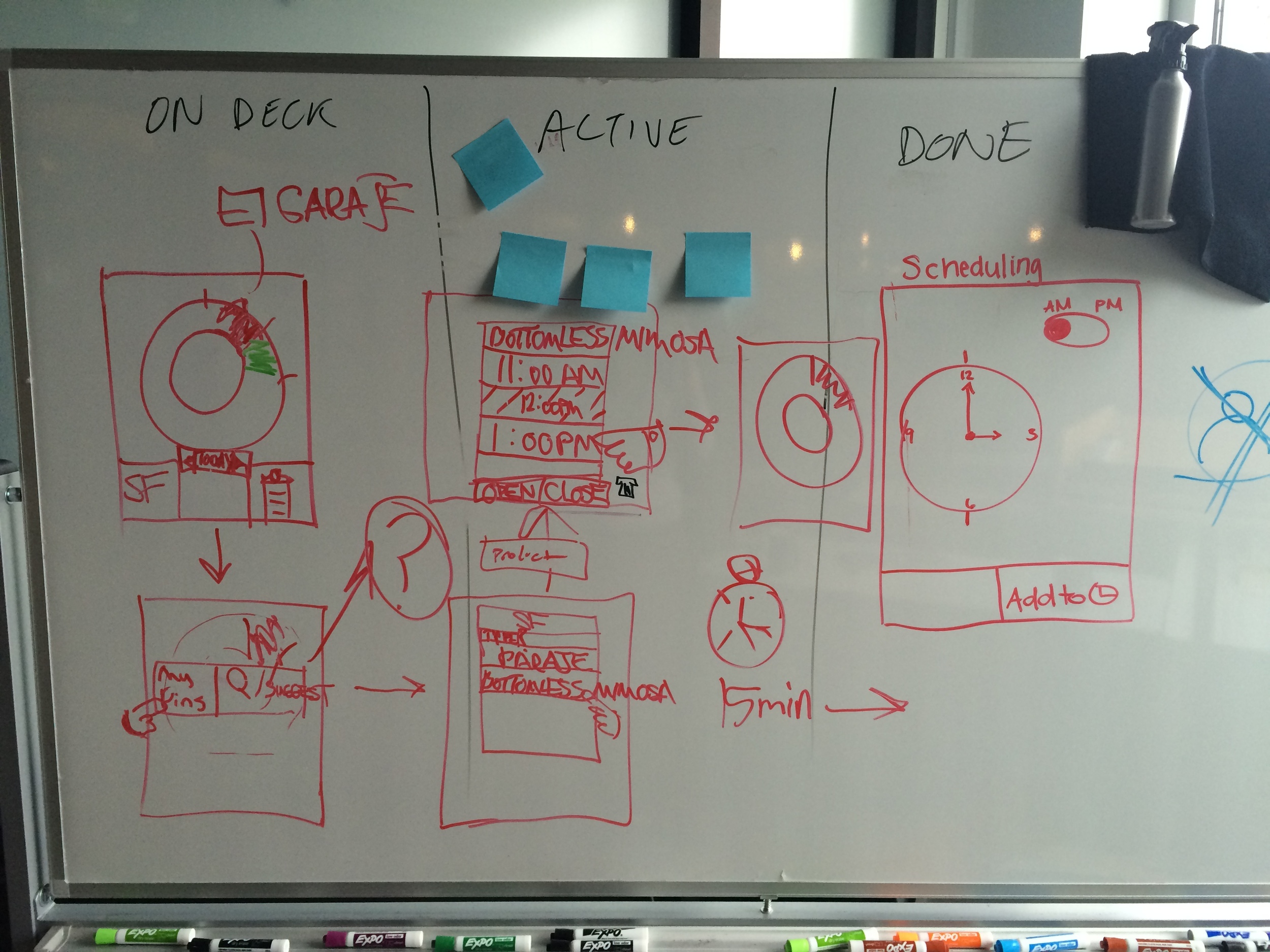
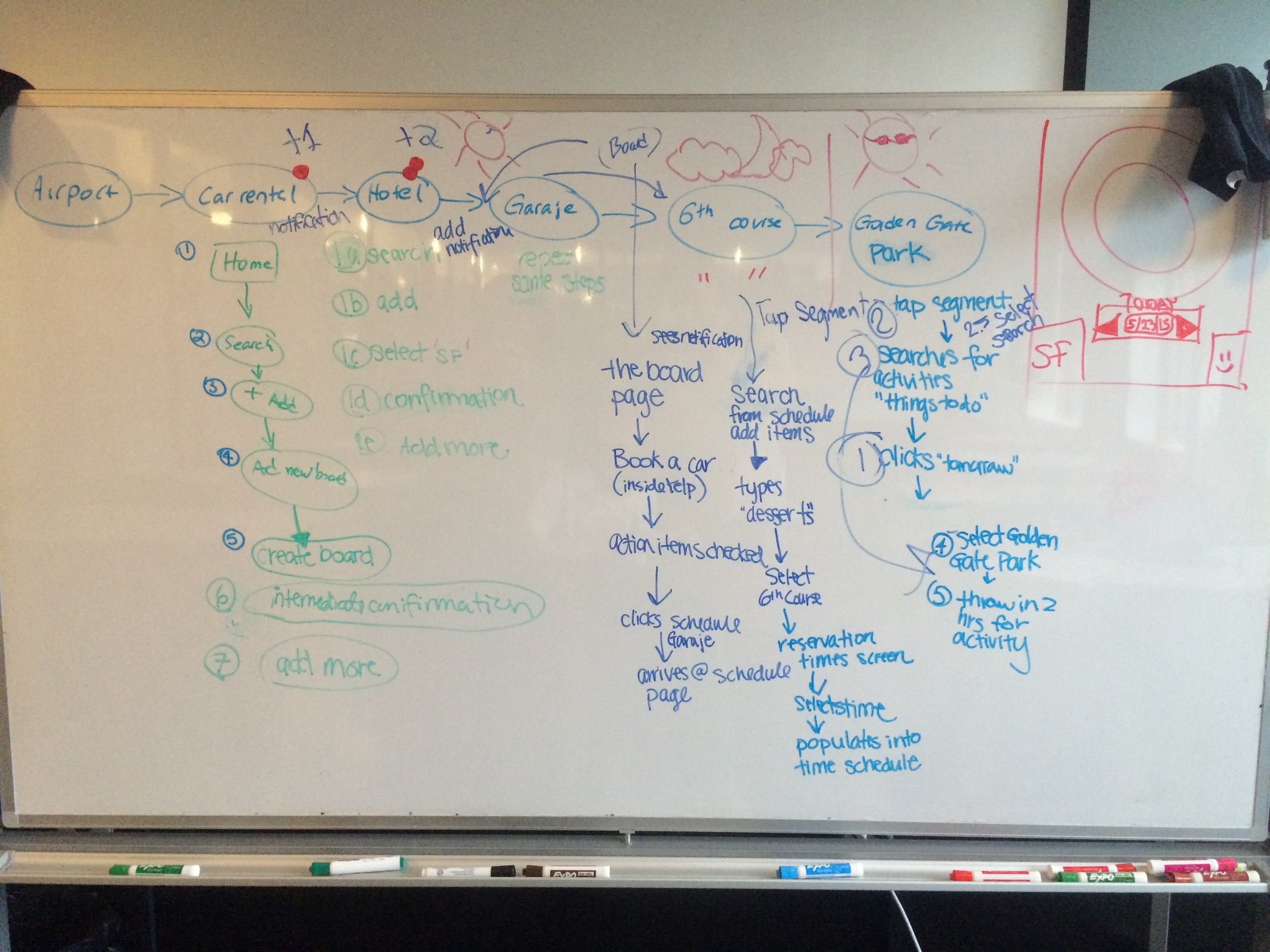
The Opportunity: This concept piece for Yelp addressed expansion of an itinerary feature, where users could take advantage of Yelp's offerings to schedule , maintain, and record their actual experiences of their travels.
The Process: We began by screening and interviewing users familiar with mobile trip planning apps, and having them participate in an on-boarding process with Yelp competitors in order to figure out immediate pain-points in the current process. We then developed a persona who is constantly traveling and vacationing in urban cities.
The Design: We noticed quickly that many users did not identify Yelp as a planning tool for future activities, as it lacked any ability to schedule. There were many iterations on a scheduling tool that we developed, and decided that for the prototype, we would use a radial scheduling widget. However, it did not test well in usability, and the tool was made to look and feel like the native iOS scheduling screens.
The Tools: Axure, Illustrator, Photoshop, Sketching


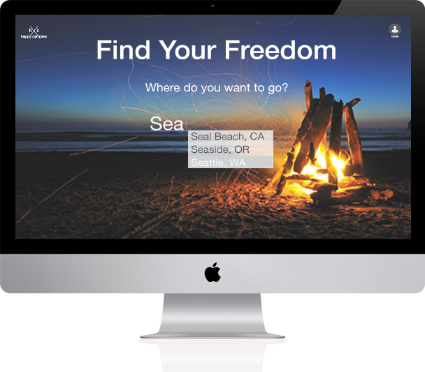
REI - Happy Campers
Desktop
The Opportunity: This concept piece for REI incorporates a camping planner application that has the ability to utilize group collaboration in the planning process in order to better organize and include members of every skillset.
The Process: I began the process by conducting interviews with individuals who adhered to screening criteria such as previous camping experience (car or backpacking). I had all participants partake in a whiteboard card sort and word association based on words coinciding with the act of planning for a camping trip. Persona generation was based on my participants who were mostly avid campers who loved fair-weather camping and activities, and always camped with others.
The Design: "Freedom" and "Openness" were among two of the most mentioned words in the card sort. I took those associations to make the "adding a trip" action in the app feel as if they were already outdoors by incorporating white space and high resolution images of camping.
The Tools: Balsamiq, Illustrator, Photoshop